
Arranging Decorative Accessories on a Sofa Table and other pieces of furniture.
The arranging of knickknacks (decorative accessories) on a sofa table, buffet, sideboard, chest, credenza or even on a fireplace mantel can be an easy task once you know a few different ways of grouping your elements.
For this post I made 12 different drawings (thirteen really if you count the cover illustration for this post) that I hope get you thinking about making arrangements with things that you already have, or inspire you to go out and find different things that you can put together and compose a tablescape with that’s eye-pleasing.
A few things to think about when assembling things for your tablescape…
(1).. When making a grouping of decorative accessories the best arrangements are composed of things that are different heights; if you can, have something tall, medium height, short and flat. Different sized pieces provide diversity which makes for a more interesting collection of elements to look at.
(2).. Collecting things in pairs is also something that should be considered. Having more than one of anything, even in an asymmetrically made arrangement, instantaneously helps to tie things together in that tablescape.
(3).. Color is also an important part of composing an interesting arrangement. Try to group together elements that share common colors (ex. blue and white etc, or metal finishes like brass/gold, copper, silver, bronze, tin etc). If things share one or more colors they look like they belong together.
(4).. Making a grouping of things that share a theme is another option. A collection of different sized ceramic Staffordshire dogs, or Chinese blue and white porcelain, or even frogs, or turtles, etc are examples of another way to go. To read a full post I wrote look at Arranging Your Decorative Accessories (Knickknacks and Collectables).
Making a tablescape with a Tall Center and Low sides.
Before I start going over the illustrations I want to address an extremely important issue that should be considered when assembling a tablescape, especially if it is on a sofa table. When composing a tablescape for a sofa table, because the sofa table is not placed up against a wall where pictures or a mirror are hung, but is floating out in a room behind a sofa, the arrangement that you create should have a center placed element, and all of the other decorative accessories should be placed around it. The center placed element will suggest symmetry and it will relate better with other things in your room. If you try to make an asymmetric arrangement and have it on a sofa table, without the center element, it will be pulling either to the left or right, because it does not have that one center piece as its anchor. The center piece does not have to be the biggest piece, or the most predominate piece in the arrangement, but it must be there.
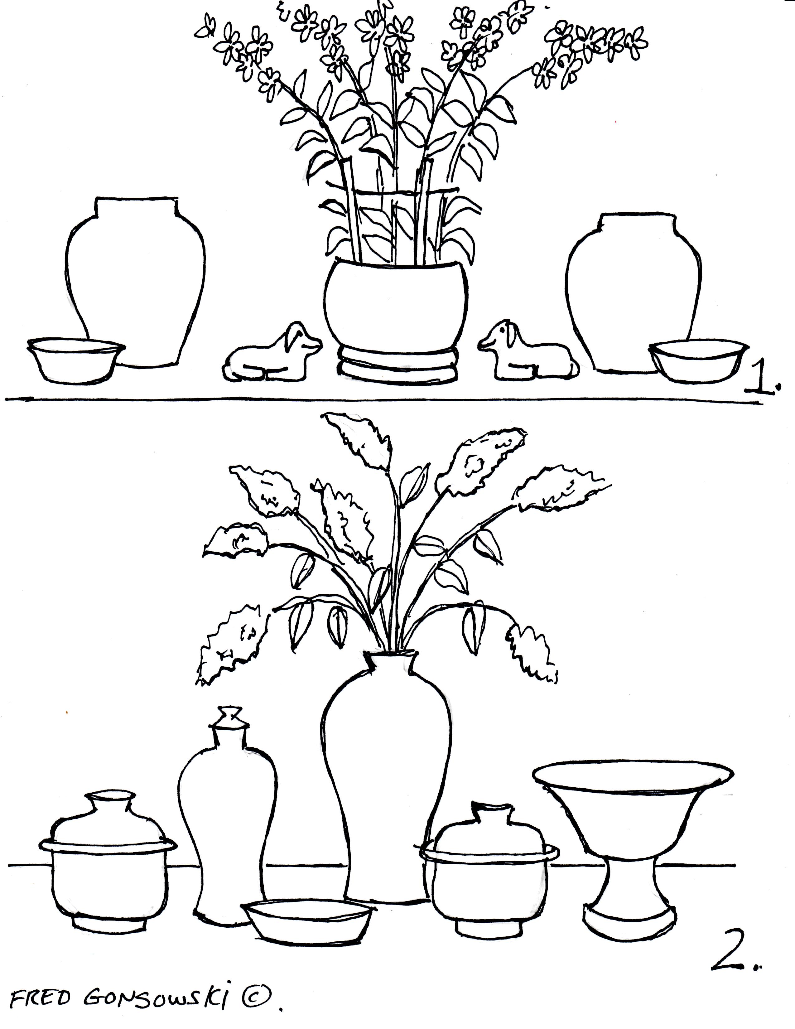
Now lets look at illustrations 1 and 2.
Illustration 1 has a tall center element, the potted plant, and it is flanked by a pair of medium-sized urns on its sides. There are also two small animal pieces between the two urns, and two flattish bowl-shaped elements flanking the ends of this grouping. Notice how there is one unique center piece, the potted plant, and everything else in this tablescape is made up of pairs of elements, and all the different pieces that make up this arrangement are laid out in a balanced order. This grouping also has elements that are high, medium height, short and flat, like I wrote about in #1.
Illustration 2 has an asymmetric arrangement of elements. It has the same tall center piece that illustration 1 has, but it is flanked by an assortment of different styles and heights of elements. The things that help to make this grouping of pieces work are the two matched covered bowls that are seen on both sides of the center element. The covered bowls add a visual balance and a repetition of elements to this tablescape even thought they are not placed directly to the left and right of the center element.
Making a Tablescape with a tall and substantial center element with medium height and delicate side pieces.
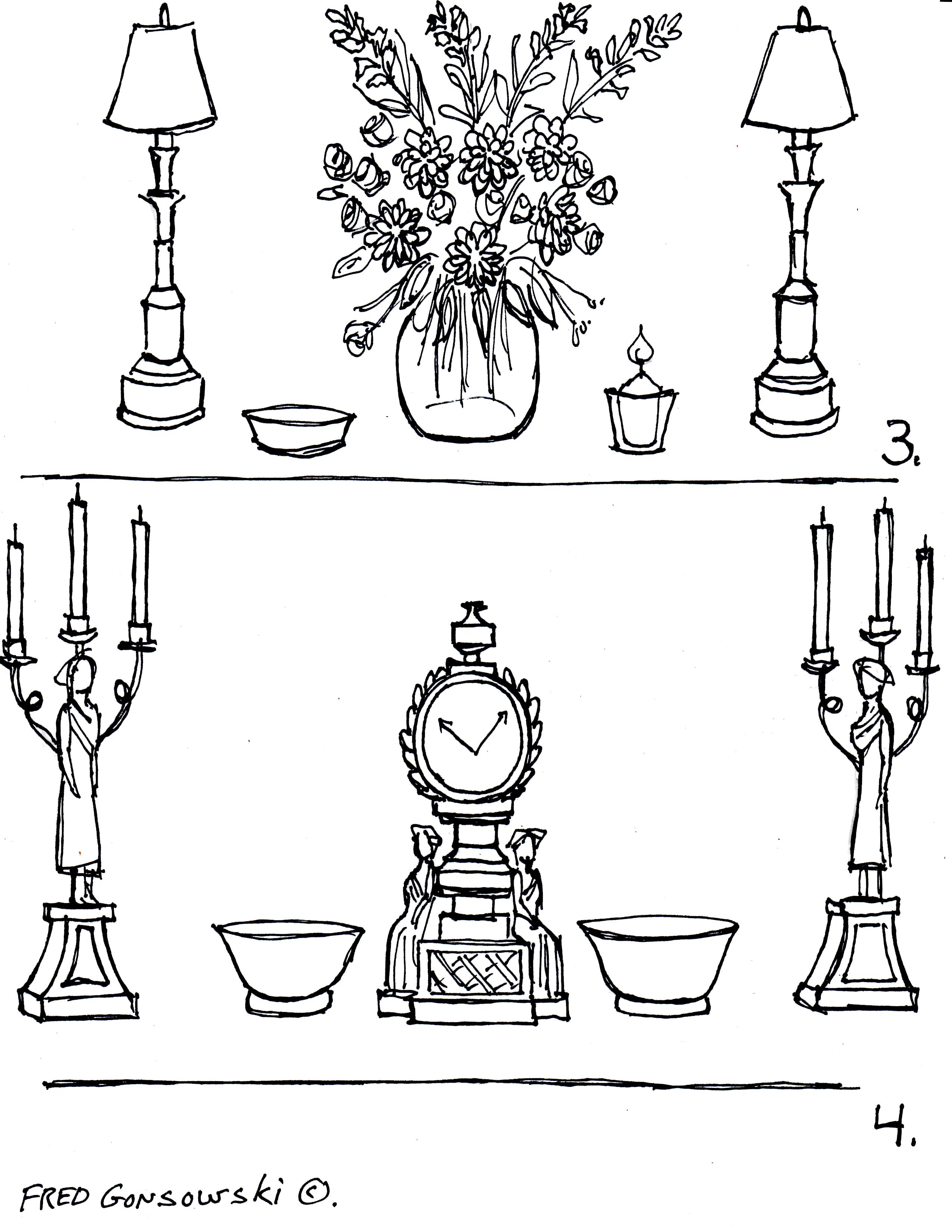
Illustrations 3 and 4 are a continuation on the theme of the tall and substantial center element, as seen in illustrations 1 and 2, but now medium height and delicate elements are flanking the ends of the tablescapes. In illustration 3 candlestick lamps that have thin profiles bookend the center element. In Illustration 4 the tall thin candles that are part of the candelabras provide the delicateness to this tablescape. Illustration 3 has unmatched elements flanking the center piece which makes it a bit more casual looking whereas illustration 4, with its pairs of matched elements, is a bit more formal. Your choice of elements (elegant or rustic), that you make your grouping with, will bring about a formal or casual feel to either of the groupings of decorative accessories .
Making a tablescape with high and thin side pieces and a low and thick center element.
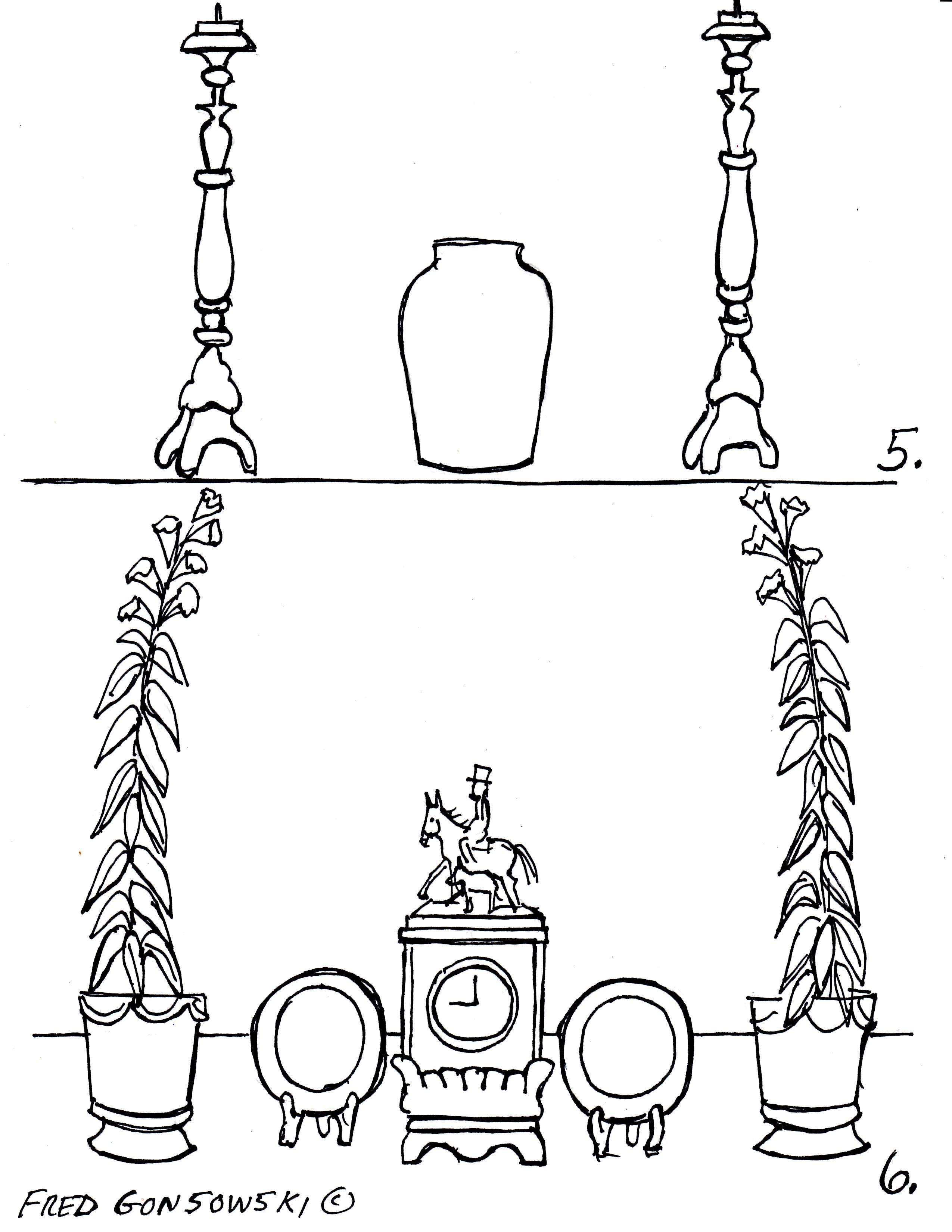
Illustrations 5 and 6 are a continuation on the tablescapes presented in illustrations 3 and 4. This time the end pieces have grown from medium height to tall. Illustration 5 shows a pair of large candlesticks flanking an urn; tall buffet lamps could also have been used. Illustration 6 shows a pair of tall thin plants flanking a center element with smaller matched pieces between the center element and the outside pieces. Once again notice how there are pairs of elements flanking a singular center piece.
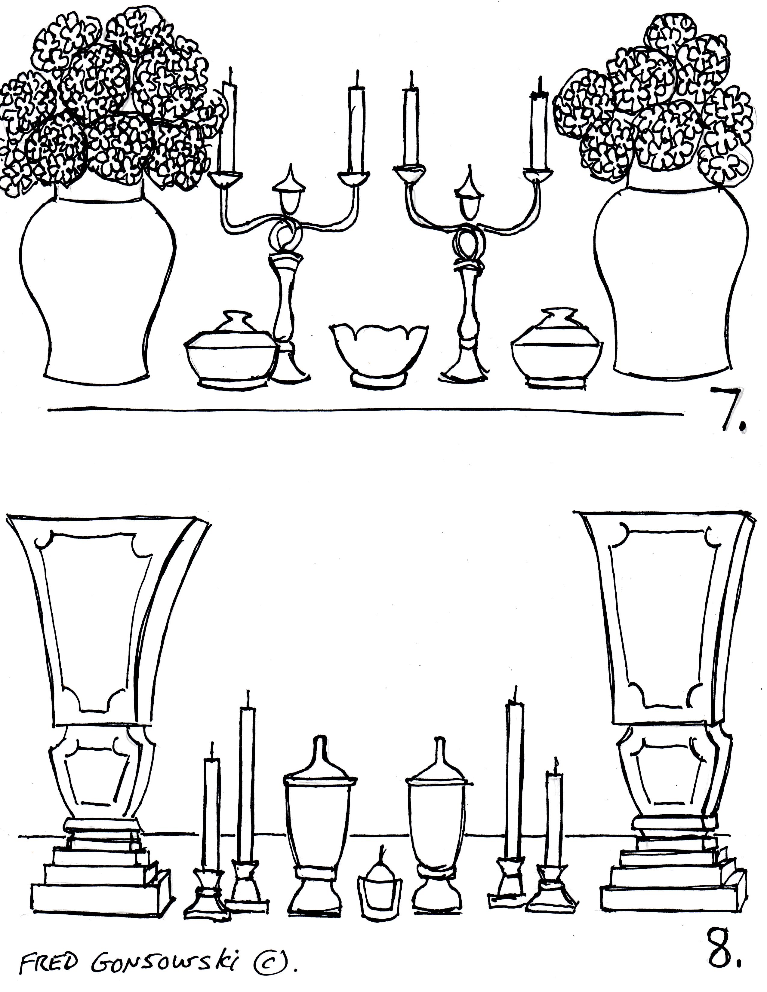
Making a tablescape with thick and heavy end elements and thin center pieces.
Illustrations 7 and 8 show tablescapes with tall, heavy and thick elements book-ending collections of thin and delicate center pieces that are different heights. Notice the small but important center most piece, in both of these two groupings, and how all the other pieces around them are parts of pairs.
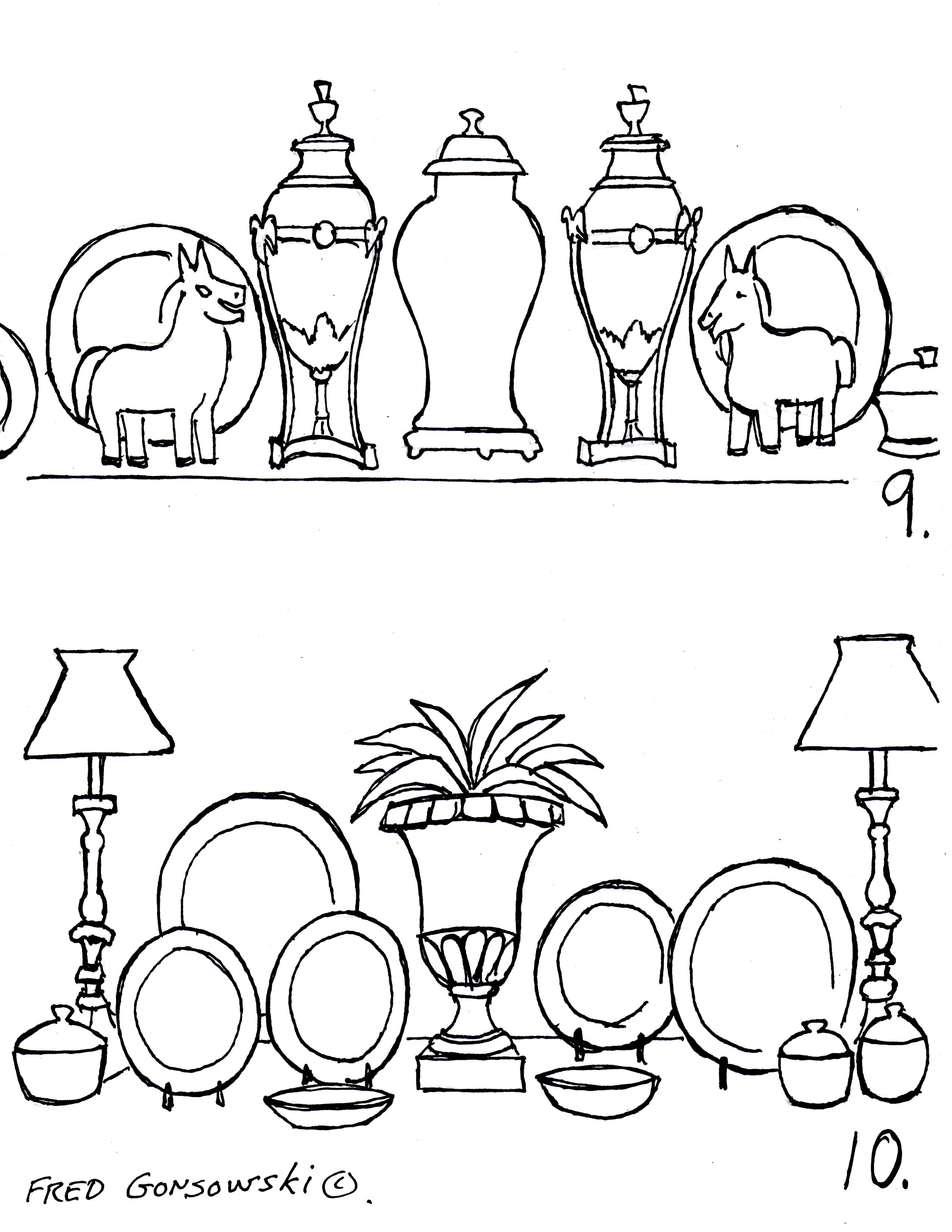
Making a tablescape with a heavy center element and heavy middle pieces.
Illustrations 9 and 10 show how a singular heavy center element is flanked by equally heavy side elements. Notice how both tablescapes become more delicate and lower toward their ends, and that both tablescaper are made up of pairs of matched elements, thought illustration 10 has them laid out in a more asymmetric way. Looking at both illustrations notice how there are a variety of heights of elements, and, in a way, illustration 10 is like illustration 3 but with more elements added to the presentation.
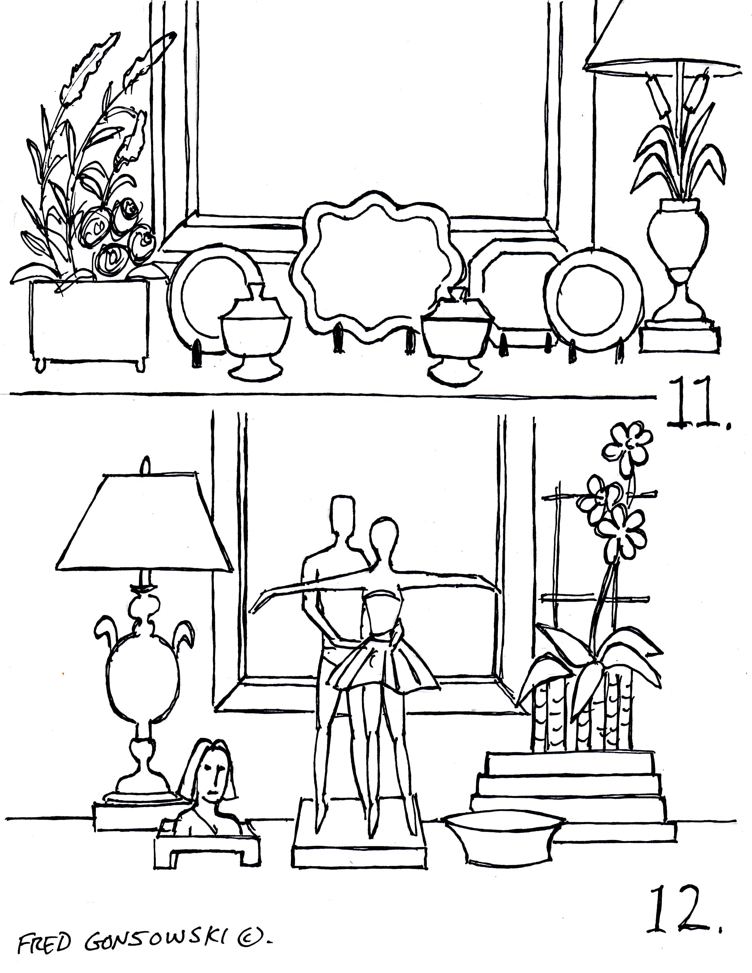
Making a tablescape with a mixture of elements in an asymmetric way.
Illustrations 11 and 12 show two arrangements of things that are not matched, but have a center element, and are considered asymmetric. Both tablescapes are composed with elements that are tall, medium height, short, and flat. The thing that unites these two groupings is not the pieces themselves, but the frame of the picture or mirror hung on the wall behind them. The frame of the picture or mirror, in this situation, is the unifying center piece, which all the pieces are arranged in front of. That is why, when making a tablescape for a sofa table, which is not up against a wall or even a window, the placement of the center element is an important factor in creating a successfully designed tablescape.
When composing an asymmetric arrangement, as seen in illustrations 11 and 12, you want to have a similarity of tonal colors. If you were composing something like illustration 11, you would want the tonal color of the flower arrangement on the left to be equal to the tonal quality of the lamp with cattail base on the right. You would not want the flower arrangement on the left to be, let’s say, pale pinks and whites, and the lamp on the right to be, let’s say, jet black. The difference between the pale pinks and whites and the jet black would be too much of a high contrast, and your eye would go directly to the lamp because it is the darkest piece. The lamp would be better if it were a soft-pale gold, a crystal piece, silver based or an alabaster white, so the color story of that element would go more with the flower arrangement.
In this post I showed a lot of tablescapes that were made with a singular center piece and most of the other elements around the center piece were pairs of things. If having pairs of things is too much for you, think about placing your elements as I did, in one of the patterns I have come up with, but instead of having two of everything, find things that are the same size, and have a similar color story or tone, and work with those kinds of elements instead. You could, for example, have a blue and white covered bowl on one side of an arrangement, but on the other side just have a blue and white bowl without a top, that is about the same size. The placement of the elements in the tablescape are a bit more regimented when working with pairs of things, but if you put unmatched pieces in the same spots as the pairs of things are, the dissimilarity of the pieces will instantaneously make the tablescape more casual.
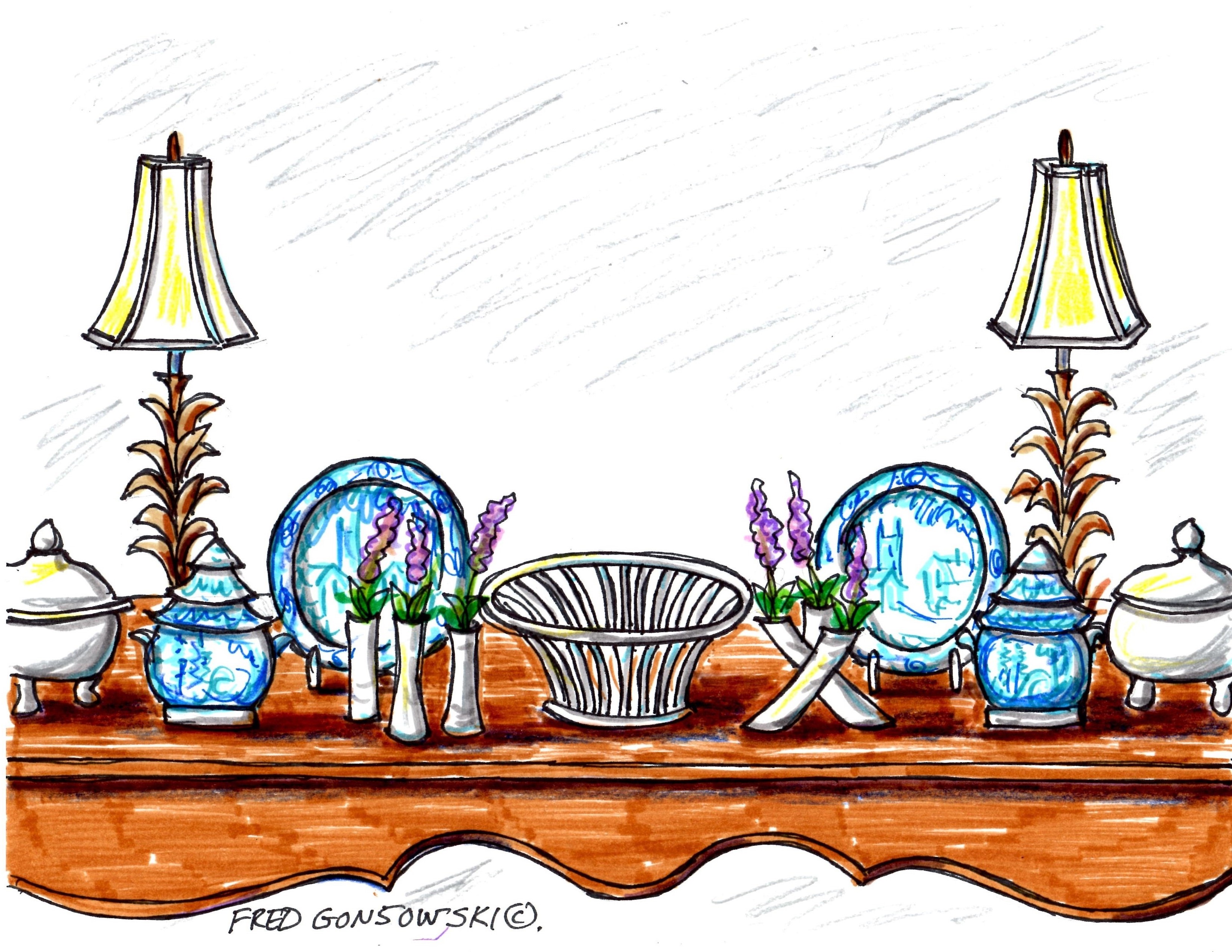
Now please look at the cover drawing for this post, notice how two different styles of flower vases flank the white basket in the center of the tablescape. There is a formality to the layout of the pieces, but the two different styles of flower vases give this grouping a more casual vibe.
Finally, now that I’ve gone over the different ways of arranging decorative accessories on sofa tables, chests, sideboards, etc. I want you to start paging through decorating magazines and to look at how different people have composed tablescapes. You will see many like what I’ve presented here, and some that are possibly composites of a couple of the groupings that I’ve illustrated in this post. There are no exact rules for how a tablescape should be laid out, but there are similarities in ways they are created.
Companion Posts…
A bridge unites a Tablescapes and Wall Decor 6-10-2011,
Interior Decorating with Accent Lamps 12-5-2012,
Interior Decorating with Table Lamps 12-12-2012,
Interior Decorating with Buffet Lamps 12-19-2012,
Looking at the Different Shapes of Lamp Bases 12-20-2013,
Interior Decorating is All about Equal Balance 2-27-2011,
Picking and Hanging the Right sized Picture or Mirror over a Fireplace 6-23-2011,
It’s Easy to make a Grouping of Pictures 6-29-2011,
Making an interesting Arrangement of Pictures 7-8-2011,
It’s Easy to Hang Pictures up on a Wall 7-17-2011,
Hanging Pictures Around a Room 8-3-2011,
Hanging Pictures over a Sofa 9-12-2011,
The Right way to Hang Curtains and Drapes 5-3-2011.


Hello Fred,
Well this is definitely a reference piece that will take some time to digest and will certainly be among my favorites of your posts! I had been waiting (impatiently) for your next post and now I see why the reveal should call for patience — truly a marvelously thoughtful post that I can refer to again and again. Thanks so much for your delightful illustrations, too, as they make the concepts you teach come alive. I enjoy periodically changing up my foyer console tabletop and this will definitely help me keep an assortment of eye-pleasing arrangements going.
Hi there Suzanne, the production of a post, especially if it has many illustrations takes a bit of time.
First of all I had to go through a giant pile of magazines (about 30) and look at every page to see different arrangements on chests, sofa tables, buffets, etc. I labeled each possible page with a posted note and a description of what that tablescape looked like. I then made a list of the titles of the repetitive arrangements that I was seeing so I could isolate them for the drawings.
After all that I had to make the illustration; which took one full evening and two really long afternoons to complete.
The post then had to be written. Writing a detail oriented article takes a bit of time. It is like chopping out something with a chain saw, then taking woodworking tools to refine the initial rough-cut. It is one thing to know how to do something, and another thing to put it into words that someone can easily follow, especially for people who don’t know that much about design.
The typing of the post is next, I write it all out in longhand using a red pen on white computer paper. Even thought I think the initial draft reads OK, sometimes I still have to make corrections when I can see it up on the screen in its entirety, and I like to “bold” words for emphasis, etc.
When I put up something, my name is on it, and I try to do my best, at the time I’m sending up an article. From the first posts that I wrote, to the ones I send up know, I think I have grown as a writer. So now you know why I might be sending up only one or two posts per month; and as with everything, life does not stop for me so I can write these things ;-}
Love this post. So helpful. Thank you Fred.
Thanks Kim D!
Up until this post Fred my console tables, chest of drawers etc. were anchored with what I thought was the focal point – the lighting (a pair of lamps or just one) – but I now see that it is an fact what is CENTERED to that piece of furniture – a mirror (for a console table backed by a wall), a big floral arrangement (for a floating table in a living room). Absolutely brilliant. BRILLIANT.
I have a question Fred. Are there any design rules around the piece that’s centered to the piece of furniture? e.g. a mirror should be roughly 2/3 the width of the console table…or is this were you can get creative and use your eye to work out what looks good and what doesn’t.
Thank you again Fred for all your hard work!
Hi there Kim, I would say coming up with a rule for how wide a mirror or picture should be in proportion to the width of a console table is not a good thing. I think it is not so much about the width of the piece, but the overall width of the frame on the mirror or picture and how visually heavy it looks. If you have a really heavy looking frame on a picture or mirror, and hang it over a really delicate looking console table, the heavy mirror/picture would probably overpower the thing that is below it. In one of my bedrooms, I have a framed print over a chest of drawers that once belonged to my maternal grandmother. The exterior dimensions of the chest is 29 1/2 inches wide and the art piece is 24 inches wide. So there are only about 2 1/2 inches of space on each side. The thing about that picture is that it has a wide white mat and a small profile frame, which doesn’t look all that heavy; so even if it is almost the width of the chest, it does not overpower it. So in this case, I would say use your creativity.
I have an idea for you. Go out and find a few pictures or mirrors that you like and get their exact dimensions. Make newspaper templates/patterns the exact same sizes as the pictures or mirrors that you like and tape them to the wall using blue painters tape. Arrange the decorative accessories that you have in front of each of the silhouettes and see which one works best in your situation. After you find one that works best, go back to the store and buy that piece. In the world of decorating, 99% of the people buy things that are too small versus too big for their project. I hope this comment was a bit helpful ;-}
This is a fantastic and very helpful tip Fred (and I’ll definitely use painters tape for my next console table arrangement). I wasn’t thinking about heaviness of a frame. Thank you kindly.
I can’t think of enough superlatives to describe the genius of Fred Gonsowski, his articles are always The Best Ever Go To. They have helped me immensely and often, not only in my home but also my volunteer work as product placement for a non profit thrift store. (Habit for Humanity) How serendipitous that his generous sharing of his considerable talents unknowing helps in raising money for the building of affordable housing! Much Love and Greatful Appreation, Mona and Ola
All I can say Mona and Token is THANK YOU for you Lovely comment!!!!!!!!!!
WOW. What a great post from Mona & Token! And also to your response Fred.
P.S. I just discovered you and you’ve made me soooo happy. Your illustrations and writings are the ONLY ones that I have ever been able to completely understand. Most decorators write as if one already knows the info. Your info is so helpful to me. Thank You.
Rebecca
Hi there Rebecca, thanks for your comment, it is much appreciated ;-}