
Neutral Paint Colors can Trick the Eye into thinking Your Home is Larger than it really is.
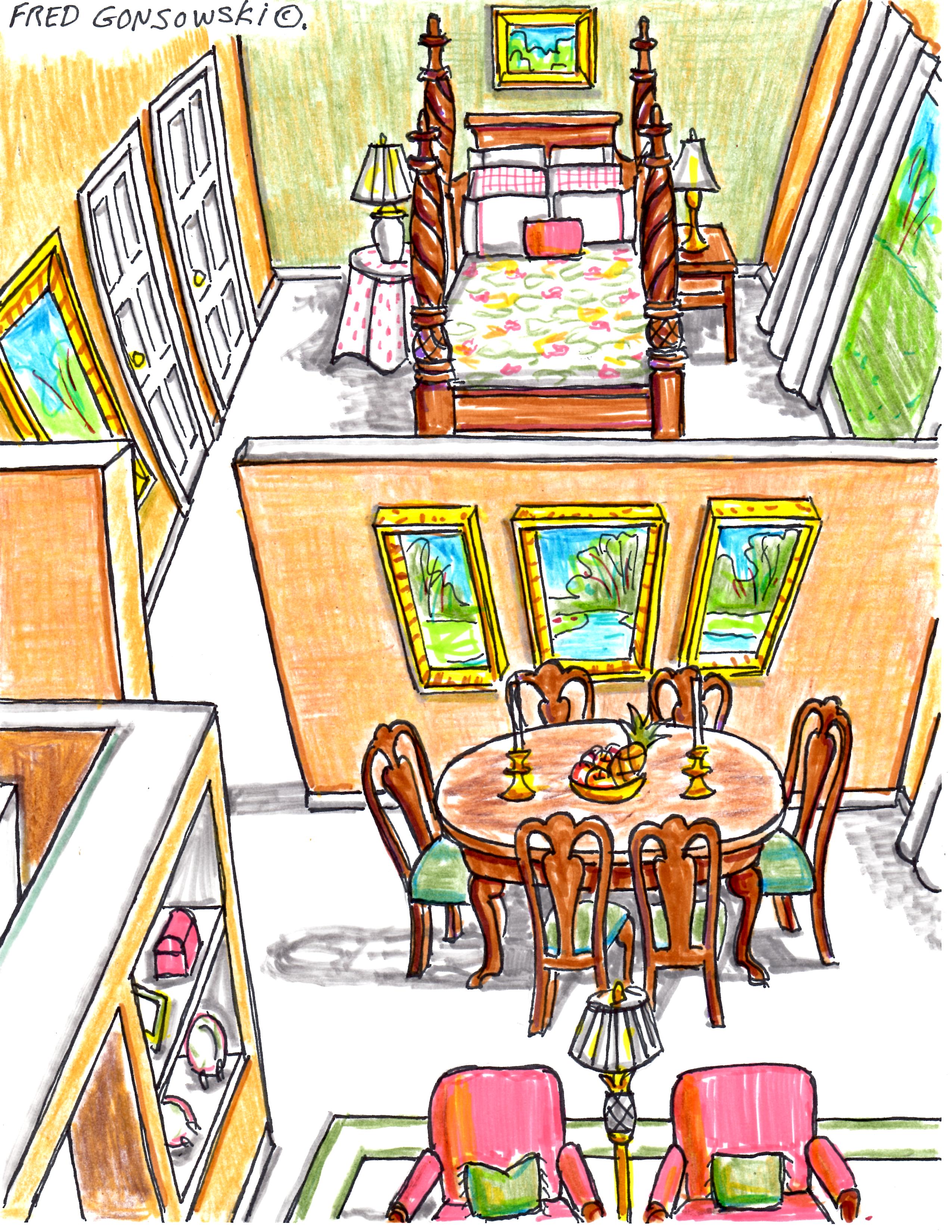
Picking paint colors for a small place or open concept spaces is really quite simple. You want to pick colors that make the spaces look airy and larger than they probably are, by tricking the eye into thinking there is more space in your new place than there really is.
When picking paint colors for a small space, you don’t want to pick colors that break up and compartmentalize the spaces. You don’t want one room in let’s say gold, one room red, one room blue, one room green, etc. You want to find one single paint color strip, that shows neutrals that go with what you have, and use all the different paint tones on that single strip in the different rooms in your home. By using paint colors from one paint color family, you will blur the lines between spaces.
Now let’s look at some paint color strips showing some popular neutrals. 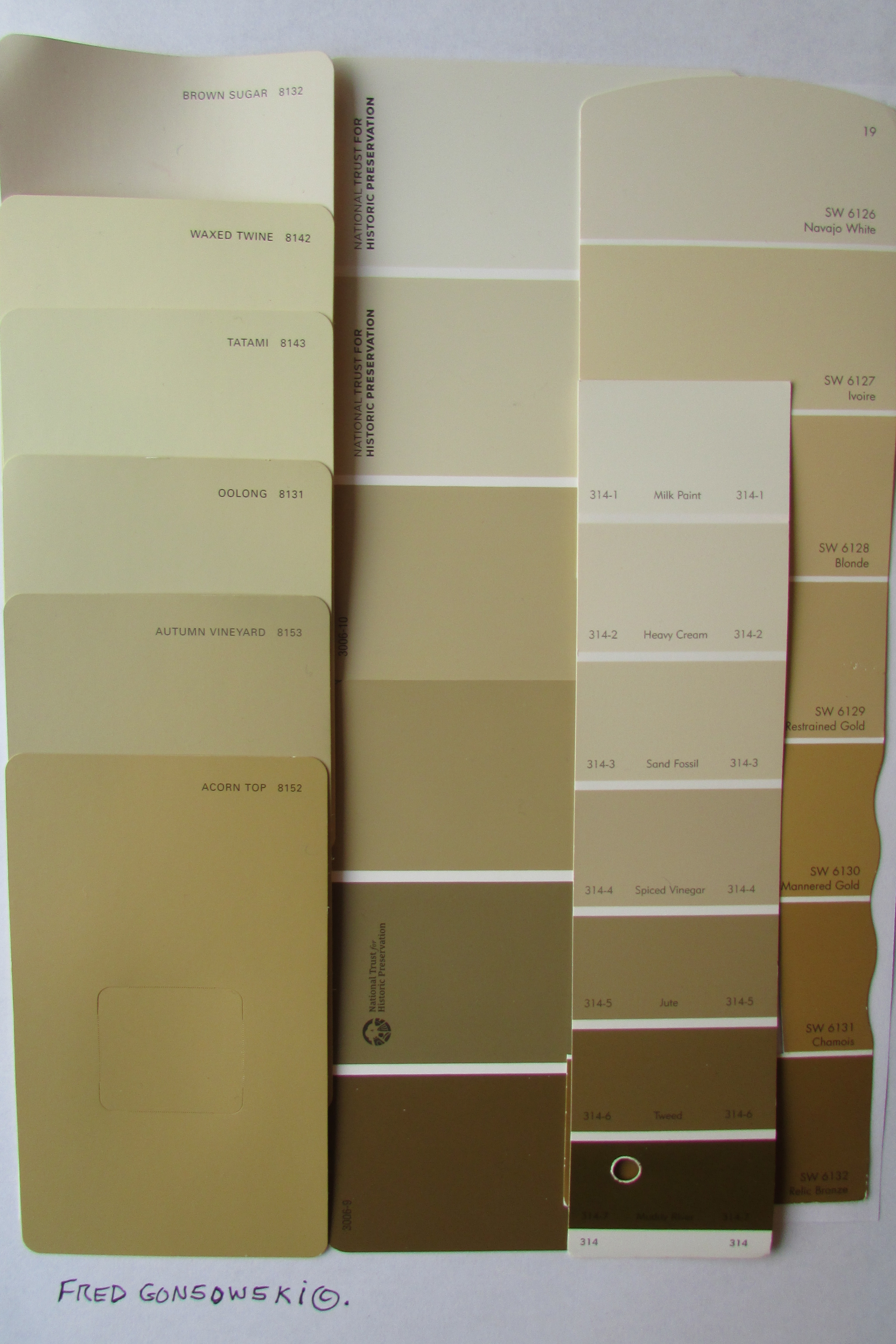 The First visual shows many different shades, tones and tints of the color Gold. Gold is probably the number one neutral color used / found on upholstery and drapery fabrics, wallpapers and patterned carpeting.
 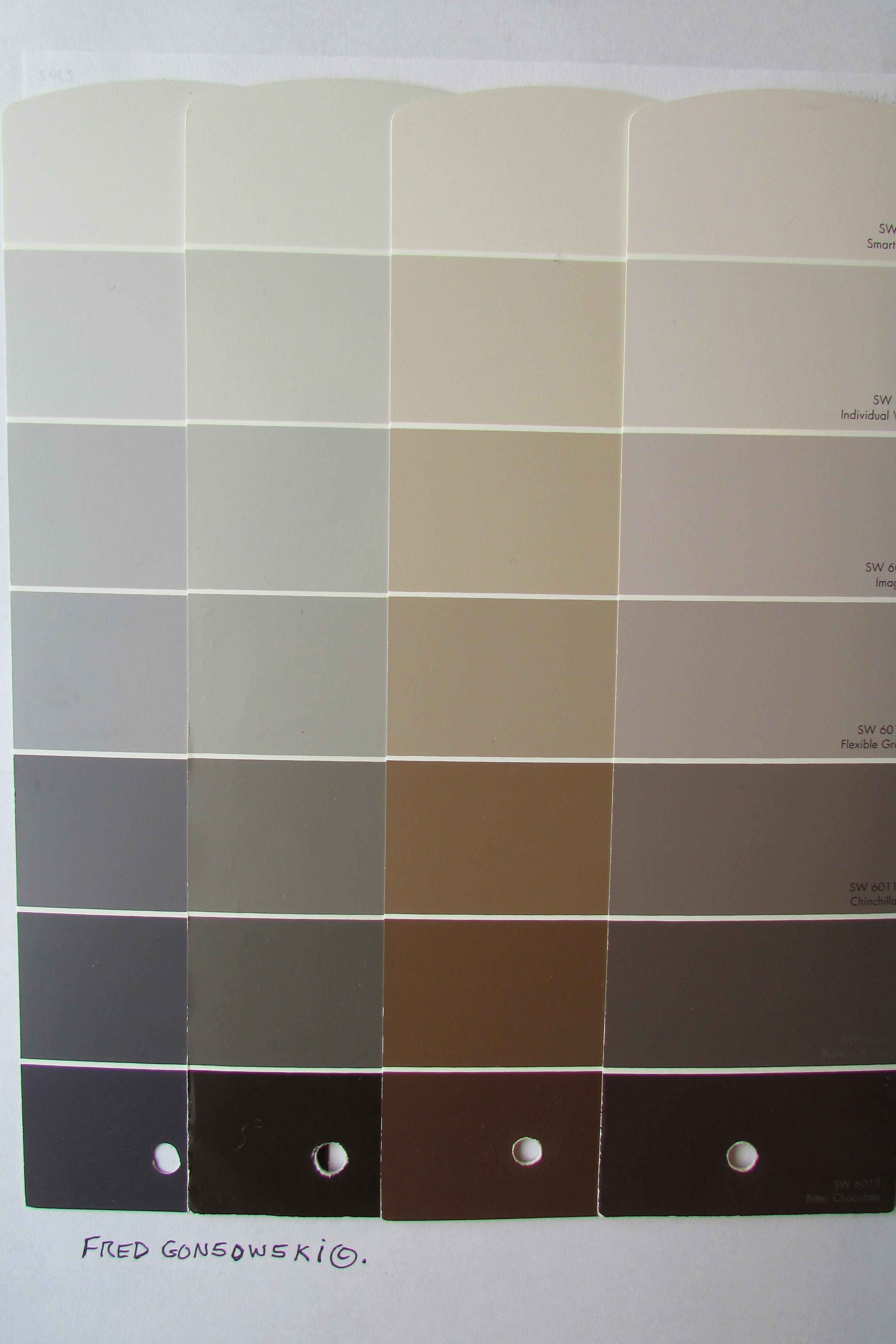 The second visual shows four paint color strips. Two different sets of shade, tones and tints of the color Gray are on the left, and two sample strips of Taupe are on the right. Taupe is a gray-beige color.
One, or many of the golds, grays and taupes assembled above, would most likely make a good neutral background color for the furniture and accessories in your home.
Finding Your Perfect Neutral
The best place to pull your perfect neutral from is an inspiration piece. A granite, marble, quartz, ceramic, Corian, or laminate island, counter top, back splash, or floor in your kitchen is one place; stone or ceramic that surrounds your fireplace opening is another. A third place to pull neutrals from are patterned carpeting, upholstery or drapery fabrics. 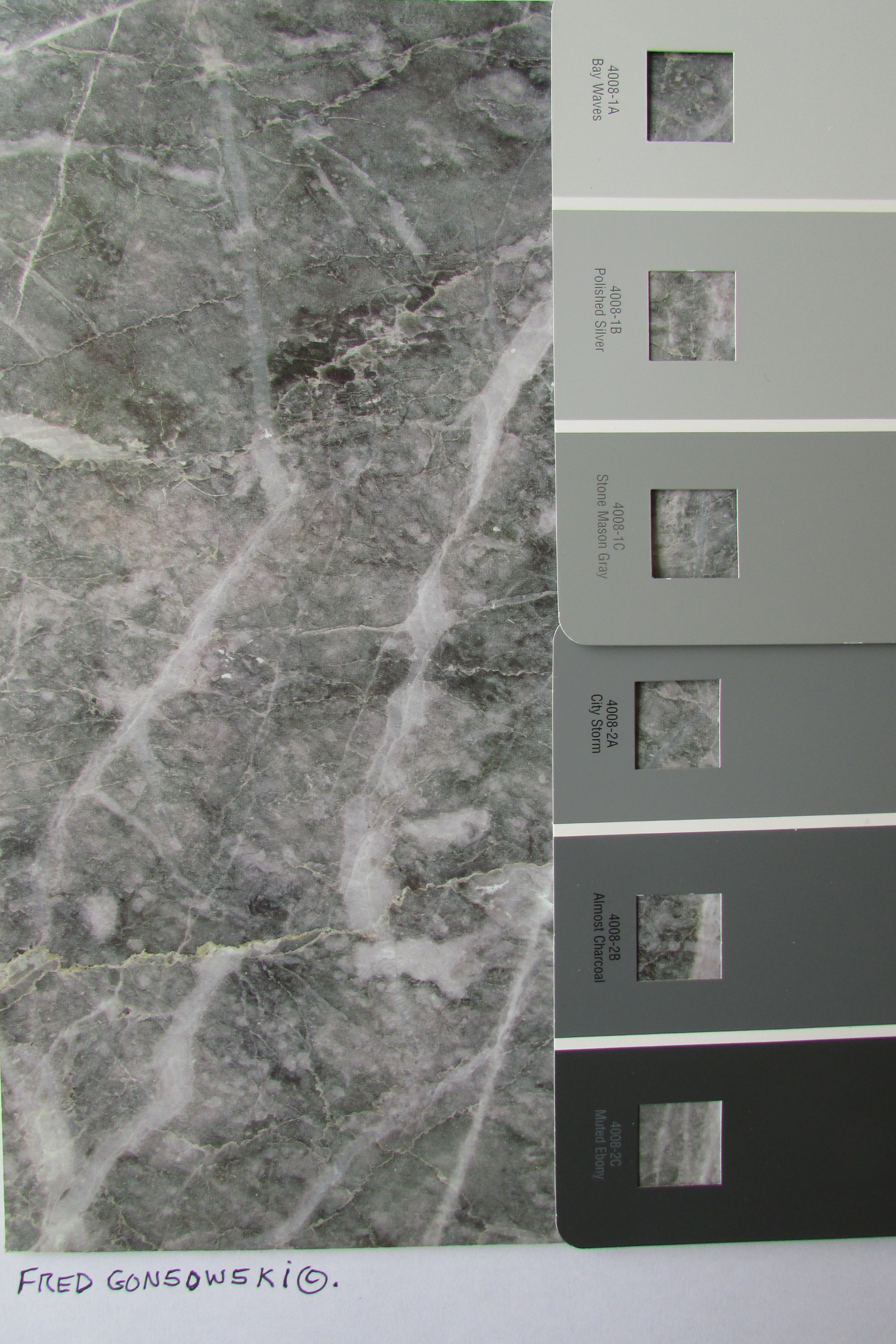
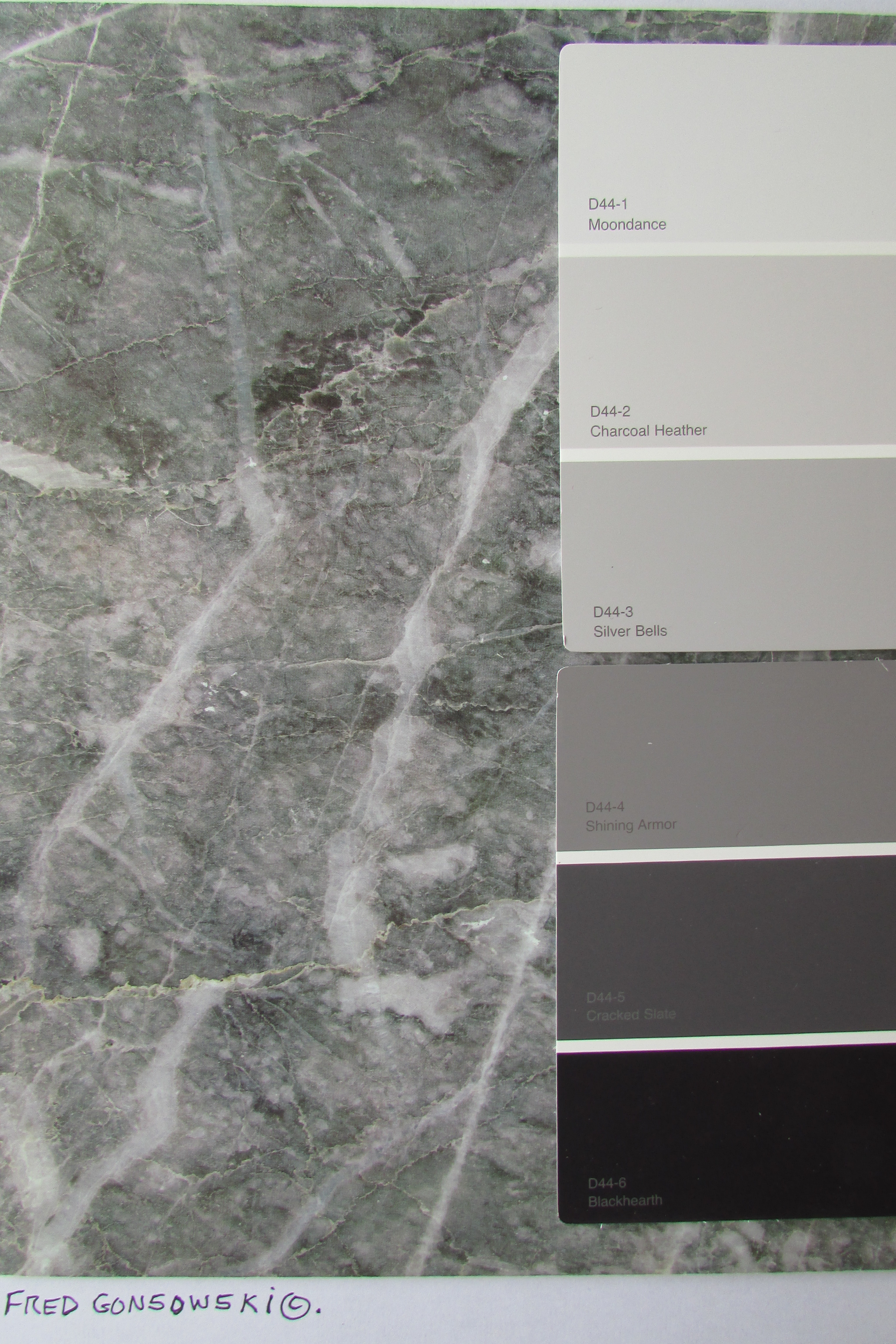 The above photos show two paint color strips with different tones of gray that could be pulled from a stone counter top. Any of the lighter tones from the two sets of paint strips would work as a neutral in your home, if you had stone like that as an inspiration piece.
 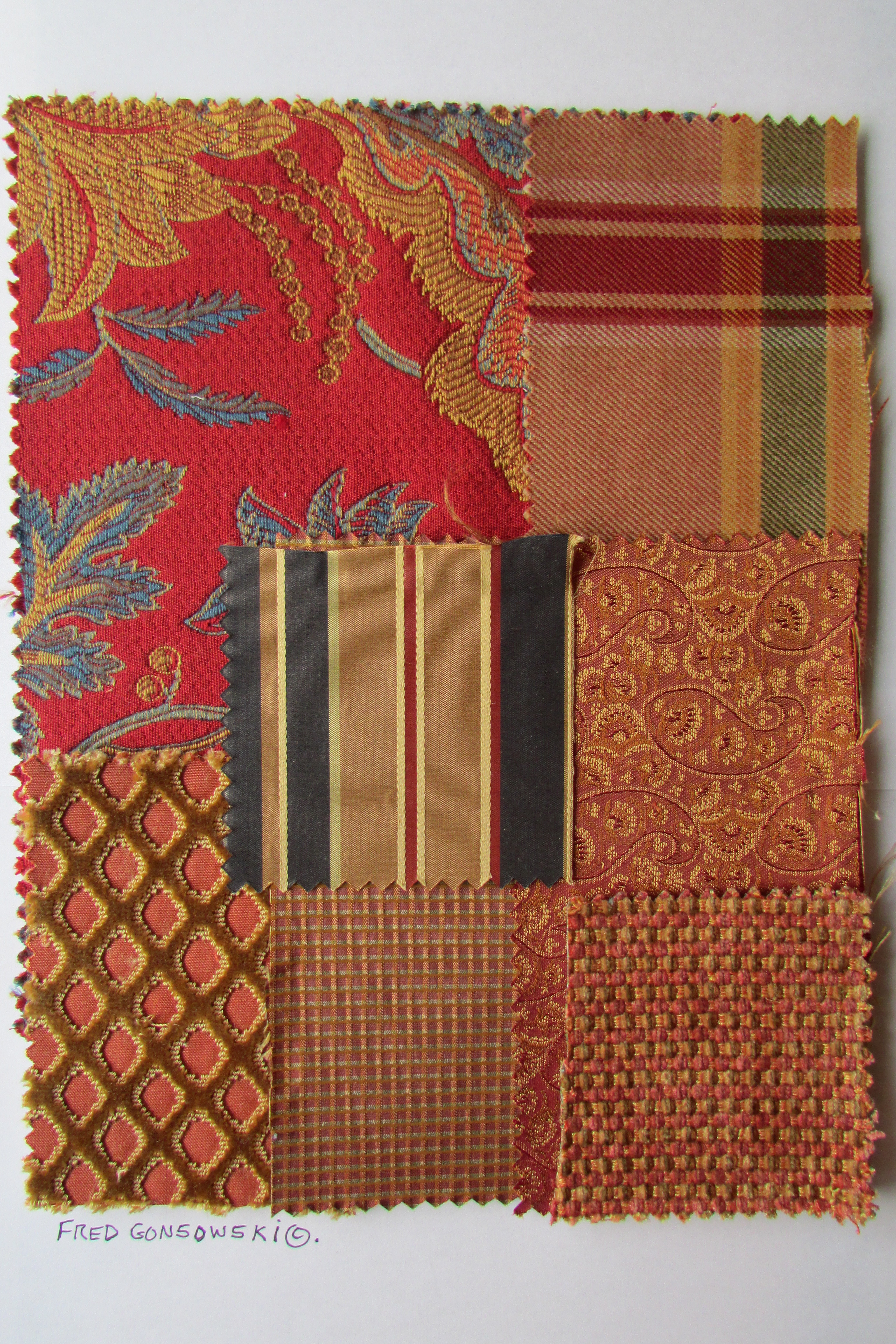 As stated before, Gold (light, medium and dark tones) is a popular neutral that is seen as part of the color story on fabrics, wallpapers and patterned carpeting, no matter if they are traditional, transitional, country or contemporary looking. Now look at how gold was used as part of the color ways of these diverse patterned fabrics.
This post is about using one color throughout a house to blur interior spaces. Recently I saw a house for sale on-line where every room was painted the exact same shade of gold; by doing that the rooms became monotonous to look at. To remedy the over use of the one tone of gold, accent walls in lighter and darker shades of that exact gold would help immensely; the change of just one wall here, and one wall there would make a big difference.
When using a single color throughout a house, you have to use different tones of that color in different rooms to keep the eye excited. You could use, let’s say, light gold in a living room and possibly a bedroom. A medium gold could be in a hall and possibly the kitchen. A dark shade of gold could be used in a dining room and possibly a guest bathroom. You could even paint one wall in a hallway going to the sleeping area of your house in a medium-dark shade of your chosen neutral color, and the other walls could be in a lighter tint. You get the picture, try to keep using different tones of a color throughout your spaces.
Another neutral painting option for your home is to paint three walls in any one room in, let’s say, one of the different shades of gold, and on the fourth wall paint a completely different color. The fourth wall would be an accent wall. The accent wall is most often the longest wall you first see when entering a room. The introduction of the different colored accent wall would work best in a compartmentalized space like a bedroom for a boy or girl, a bathroom, home office, etc, where you want to personalize it more.
By introducing the accent color on just one wall in any given room, you would keep the continuity of color (in this case gold) going from one room in your home to another, but the accent wall would give you another paint color option. Even when three walls are painted in, let’s say, the neutral gold and one wall is painted in let’s say, a coral pink, that room will read as and thought of as a pink room.  In the world of colors, there are two distinct color groupings; they are warm and cool.
Looking at the upper half of the color wheel, all the different colors located above the central horizontal line (orange-red, orange, yellow, yellow-green and green) are all warm “Yellow Based” colors. Yellow is part of / one of the colors needed to make these colors (red + Yellow = orange / Yellow + blue = green).
Looking at the lower half of the color wheel, all the different colors located below the central horizontal line (red-violet, violet (purple), blue-violet, blue and blue-green) are all cool “Blue Based” colors. Blue is part of / one of the colors needed to make these colors (Blue + red = violet (purple) / Blue + yellow = green).
True Red, seen at the lower left on the color wheel (in the 8 o’clock position) is kind of a color wheel neutral; it can be both warm or cool, and fits into both color families.
When picking a different shade / tone of a color to go along with your neutral wall colors, you will have to first think about which color family your neutral is part of. Gold, as talked about in this post is a yellow based color, so your best companion colors for it are also yellow based. If you have a gold room, and want to introduce pink into it, the best tone of pink for you is coral or salmon, as those two pinks are yellow based, and are lighter versions of orange-red, as seen on the color wheel.
If a person tried to introduce a mauve (blue based pink) into a gold (yellow based) room, they would not work that well together. Mauve which is a cool color of pink is blue based, and is a lighter version of red-violet, as seen on the color wheel.
So, to find the right companion colors to do an accent wall in, first figure out if your three neutral walls are either warm (yellow based) or cool (blue based) as seen on the color wheel. After that pick colors that come from that same side of the color wheel to match your neutral wall color (3 warm walls + 1 warm accent wall) or (3 cool walls + 1 cool accent wall).
Shades and Tints
When looking at paint color strips or even the color wheel shown in this post, the darkest version of a color on a paint color strip or the color wheel is called a shade. The lightest version of a color on that single paint color strip is called a tint. All of the other tones of color on that single paint strip were achieved by adding different amounts of pure white to the shade to lighten it. All of the colors on any single paint color strip are all part of the same color family. 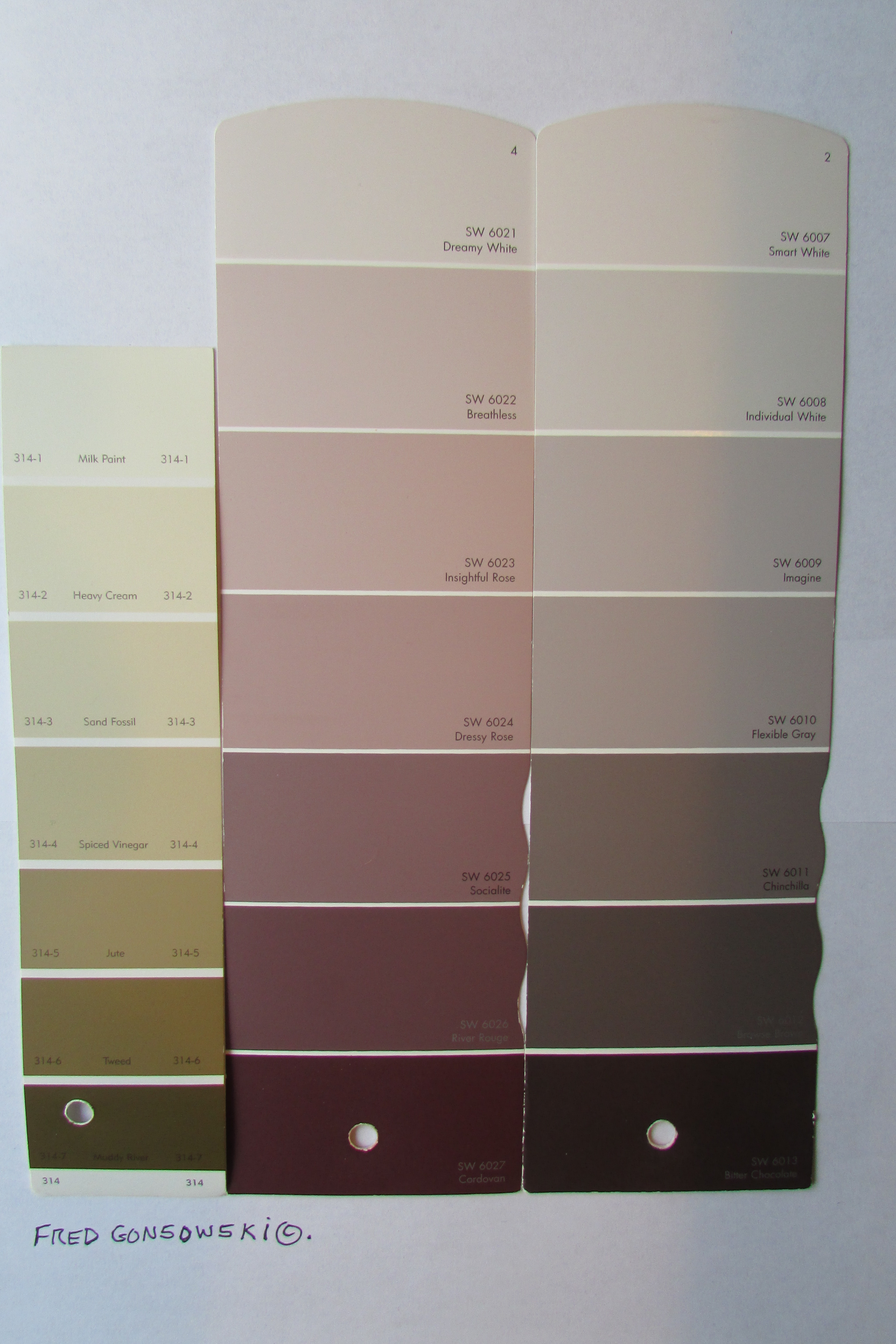 The Three Beiges
In the world of neutrals, Beige is right behind the color gold. There are three different kinds of beige.
The First is Golden Beige, sometimes thought of as khaki (seen on the left), it is made by mixing gold, brown and white together. It has golden undertones which puts it with the warm colors on the color wheel.
The Second Beige is Rose-Beige (seen in the center) which is a cool toned beige. It is made by mixing brown, red-violet and white together. Violet (purple) which is made by mixing blue and red together puts red-violet and Rose Beige in the blue based cool color part of the color wheel.
The third beige is Taupe (seen on the right). Taupe is a mix of gray and beige or black, brown and white. It is considered a warm color. Sometimes taupe is thought of as a brownish gray and other times it is looked at as a grayish brown. Sometimes gold is added to taupe which makes it even warmer toned, and by adding the gold it fits in even more with the warm side of the color wheel. Fabric and textile designers have been known to use together golden-beige and taupe or golden-taupe as part of the color stories when designing upholstery, bedding and drapery fabrics and well as ceramic tiles and multicolored carpets. 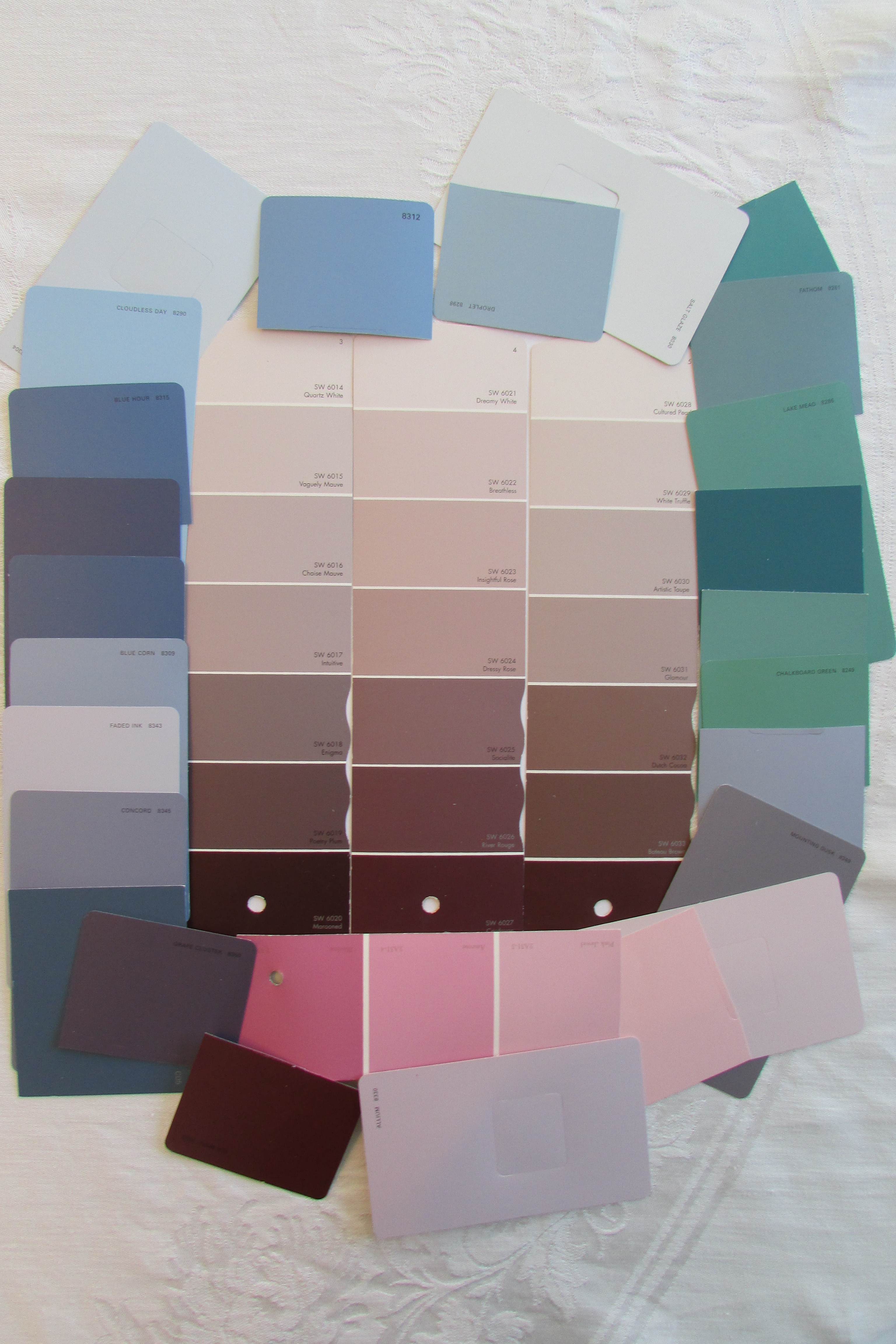 The above photo shows three paint color strips that are consecutively next to each other on a paint color fan. The three paint color strips show different versions of Rose-Beige, which is a cool toned beige. (Rose-Beige was shown between golden beige and taupe in the previous photo). An assortment of many different cool toned colors, from the blue based side of the color wheel surround the three strips. The colors that you see are tints (lighter versions) of the shades red-violet, violet (purple), blue-violet, blue and blue-green as seen on the color wheel. All these colors and many lighter and darker shades/versions of these colors, would work as accent walls in rooms that are rose-beige, or even blue-beige colored.
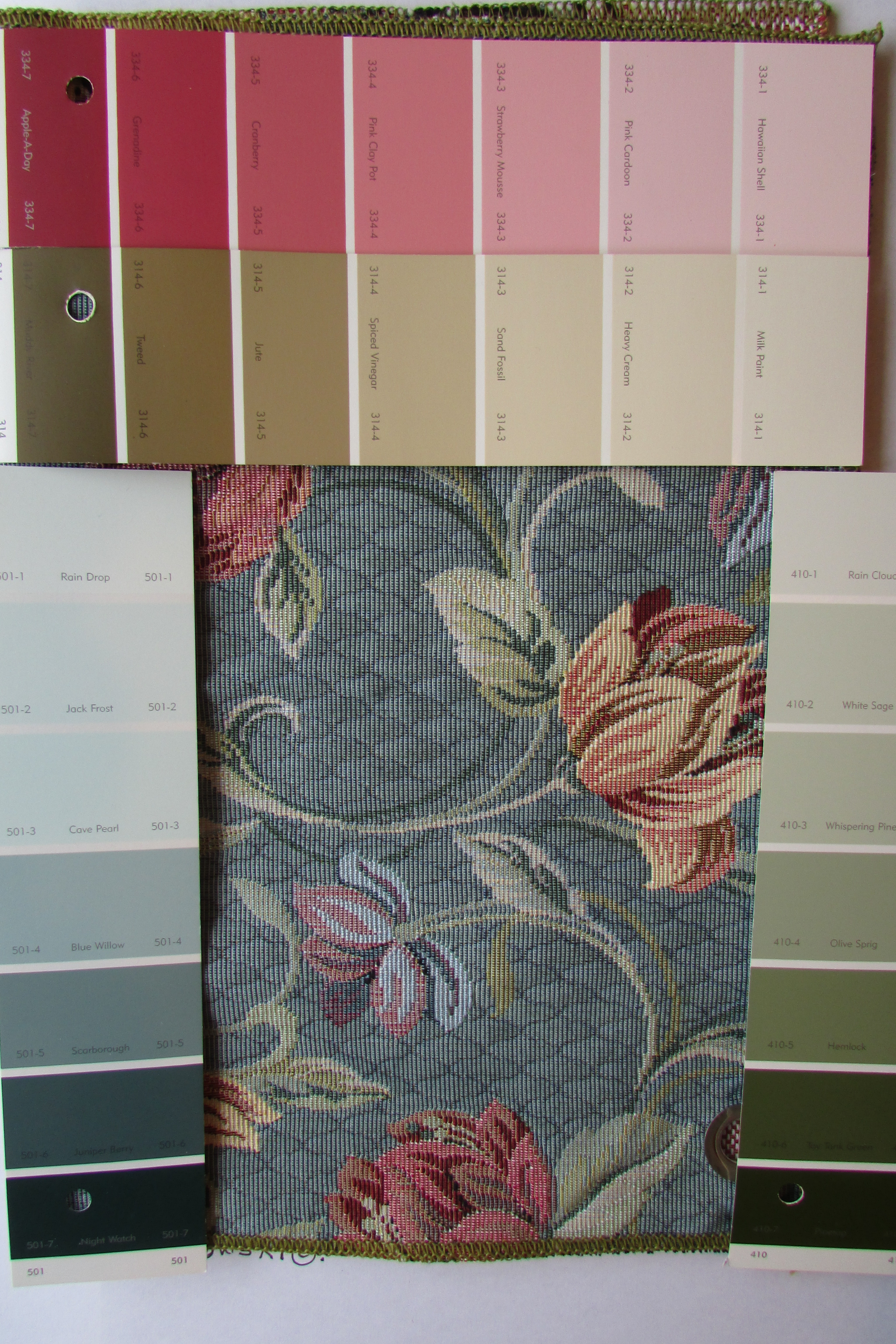 The above fabric sample is a perfect example of a an inspiration piece. The fabric is a grayed blue-green, which has yellow / golden undertones. The green part of the blue-green says yellow / gold was added. The four paint color strips surrounding the fabric sample show shades, tone and tints of the colors seen/ pulled from the fabric. Any of the lighter versions of the gold, yellow-green and grayed blue-green would be the perfect neutrals to work with, in your home, if this fabric was something you were using. The darker tones on the strips would be great for accent walls.
If a person were using many colors (like the different colors pulled from the fabric swatch), along with the “neutrals” that they are running from one room in their house to another, there are two different ways of picking tones for the accent wall. The first would be to pick any color, on any of the paint color strips, and put it with a color on another paint strip that is next to it or just one shade darker; that would produce a zen calm kind of look (the first or second lightest color on one paint strip would be paired with the first or second lightest color on another paint strip). Secondly, picking a color that is darker than the neutral that is used on the three walls in any one compartmentalized room, would cause a much more dramatic look. The choice is your.
After finding the paint color strip(s) with your perfect neutral(s) on it, carry it / them with you every time you go looking for upholstery fabrics, drapes, bedding, carpeting, wallpapers, or even other paint colors. By doing that you will be able to put it /them up next to what you are thinking about buying and you will instantaneously know if it works for you or not.
I hope this post inspired you, and got you thinking about color, tones of colors and the possibilities of blurring lines between space. Happy Painting!
Companion Posts…
How to Pick the Perfect GRAY PAINT.. A Popular Color Choice of the Moment 2-15-2014,
Accent Walls..Some Ideas for Painting or Wallpapering an Accent Wall in your Home 10-29-2013,
It’s EASY to Paint Horizontal Stripes on a Wall, Step by Step instructions 11-8-2013,
Pick (Use) four colors when decorating a room 3-7-2011,
Paint a Room a Dark Color then ADD Light Accents 3-27-2011,
Picking the Right Paint Colors to go with the Wood in your Home ..Color Theory 3-9-2013,
When Decorating a Beige Room think Tones, Texture and Sculptural Interest 3-16-2011,
Picking a Color for your Front Door 1-17-2012.
(Curtains and Drapes)
The Right way to Hang Curtains and Drapes 5-3-2011,
Hanging Valances, Curtains and Drapes on Different kinds of Windows 7-15-2012,
(Arranging Furniture)
Arranging furniture, so Sofas talk to Chairs, like the Pros do 9-7-2012,
When buying Living Room Furniture, FORGET the Loveseat, buy Two Wing, Club or Occasional Chairs instead 10-13-2012,
Arranging Furniture in a 12 foot wide by 24 foot Long Living Room 2-5-2014,
Arranging furniture TWELVE different ways in the Same Room 9-15-2012,
Arranging furniture around a fireplace in the corner of a room 9-29-2012.
(Lighting and Decorative Accessories)
The Right height of Table Lamp for your End Table 5-19-2011,
Matching the Right Shape End Table with a Table Lamp 1-12-2014,
The answer to..”Can you Put a Floor Lamp next to a Sofa?” 10-4-2012,
Looking at the Different Shapes of Lamp Bases 12-20-2013,
Arranging your Decorative Accessories (Knickknacks and Collectables) 6-7-2011,
A Bridge unites a Tablescape and Wall Decor 6-10-2011.
(Hanging Pictures and Mirrors)
Picking and Hanging the Right size Picture or Mirror over your Fireplace 6-23-2011,
It’s Easy to make a Grouping of Pictures 7-8-2011,
It’s Easy to Hang Pictures up on the wall 7-17-2011,
Hanging Pictures over a Sofa 9-12-2011.
(Fabrics)
Looking at Patterns used in Interior Decorating on Fabric, Drapes, Wallpaper and Carpeting 3-10-2012,
Looking at the Different sizes of Patterns on Wallpaper and Fabric 3-20-2012,
Mixing and Matching Fabric and Wallpaper Patterns 4-13-2012.


You are good! I completely enjoy your attention to detail. I actually know what and how to do after reading your instructions. I just bought a new home and looking forward to decorating it with you in front of me the whole way through.
Hi there Marcile, Best of luck with your new home, how exciting! Gad to be of help, thanks for your comment. My newest post, Interior Decorating Ideas for a Small House, Condominium or Apartment, I think, has links to practically every one of my decorating posts. ;-}
We just bought our house in June of this year, and the whole house is painted with an off-white primer. We desperately wanna paint our house but have no idea what colors to paint. Can someone pleeeeeease help. Our house is about 750 square feet, and the living room and kitchen are open concept. If you need pictures, and if there’s a way I can show them, I’d be glad to do so.
Thank you, Brad
Hi there Brad, is there any way you can link your photos with your comment?, I’ve had people who in the past did that. Have you read my post Pick (Use) Four colors when Decorating a Room, that posts tells you how pick four colors to decorate with, and how to work those four colors from one room to another in your house. Good Luck with your decorating Project ;-}
Another terrific review of how to properly select and stay/work within a color family. Extremely helpful! My “FRED” binder is getting huge!! Thank you Fred!
Hi there Joy, just finishing up a new post, and will be starting yours next.