

Picking the Right Color paints, fabrics, and carpeting to go with your wood furniture and woodwork
When picking paint colors, fabrics, carpeting colors, etc, a person has to first figure out if their wood furniture is either yellow based (warm) or blue based (cool), and adjust their color choices from there.  The Color Wheel ..All colors are really made by combining just three primary colors; Red, Yellow and Blue. If you have an Epson color printer-scanner like I do, your Red is Magenta and Light Magenta, you have one Yellow, and your Blue is Cyan and Light Cyan. Black is also part of your ink supply to darken the just mentioned colors.
In the scientific world White is considered all colors. White light passing through a prism refracts and makes all colors creating the rainbow. Black, being opposite to white is considered the absence of all color.
The three Primary colors Red, Yellow and Blue, when combined make the Secondary colors. Red plus blue makes Violet (purple). Red and yellow make Orange, and Yellow plus blue make Green. The Tertiary colors are made by combining one primary and one secondary color that is along side of it on the color wheel. The tertiary colors are Yellow-Green, Blue-Green, Blue-Violet, Red-Violet, Red-Orange and Yellow-Orange.
Now look at the color wheel. The Warm Colors, as I said before are made by combining Yellow and another color. The warm yellow based colors on the color wheel are yellow-green, yellow (the first primary color), yellow-orange, orange (yellow+red), red-orange, and red (the second primary color).
Your Cool Colors are all made by adding Blue to a color. The first cool color is red-violet, then violet (blue+red), followed by blue-violet, blue (the third primary color), blue-green, and green (blue+yellow).
On the color wheel, colors that are directly across from each other are called opposites or complementary colors. The primary opposites are yellow and violet (purple), red and green, and orange and blue. Of the three groupings just listed, the first color is the warm color, the second is the cool. All the other colors between the primary and secondary colors have their opposites, which are shown across from each other on the color wheel.
If a person were to mix any of the colors on the color wheel with a color directly opposite it, depending on how much color was added, they would get different degrees of a brown-muddy color.
Looking at Paint Color Strips
On the paint color strip samples for this section of the post, notice that the darkest tone (shade) is at the top of each strip, with two lighter tones below it. Then go to the bottom of the strips and notice how the progression of tones works upward, ending with the lightest tint of that color strip in the center. 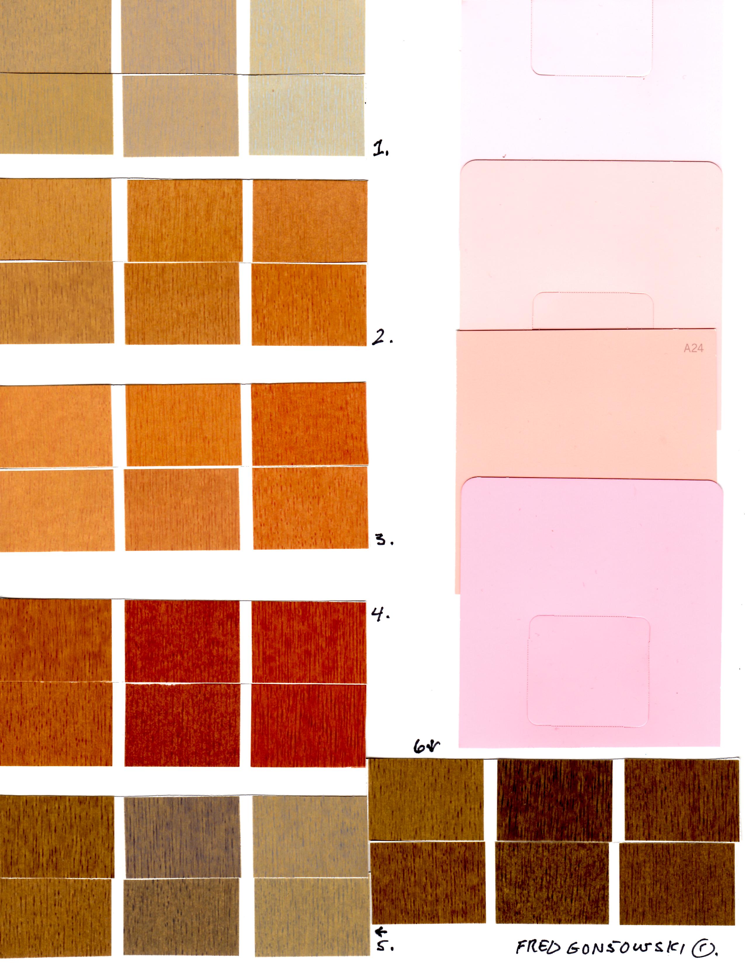 Yellow Based Woods and Paint Colors that go with them ..Golden oak, birch, honey maple, hickory and pine are some of the names of yellow based woods. If you were trying to compare them to the color wheel they would be yellow to yellow-orange in color. Old maple, natural cherry and red oak are examples of woods that are red-orange in color. They are on the darker side of the yellow based woods.
Now look at color sample 1, which shows a sample of wood that is golden beige; it would be close to yellow on the color wheel.
Samples 2 and 3 show wood tones that are close in tone to yellow-orange.
Sample 4 is similar to red-orange on the color wheel.
Wood color samples 5 and 6 both show medium to dark brown wood with strong golden undertones. Color samples 5 and 6 could be shades (darker values) of sample 1, which could be a lighter tint.
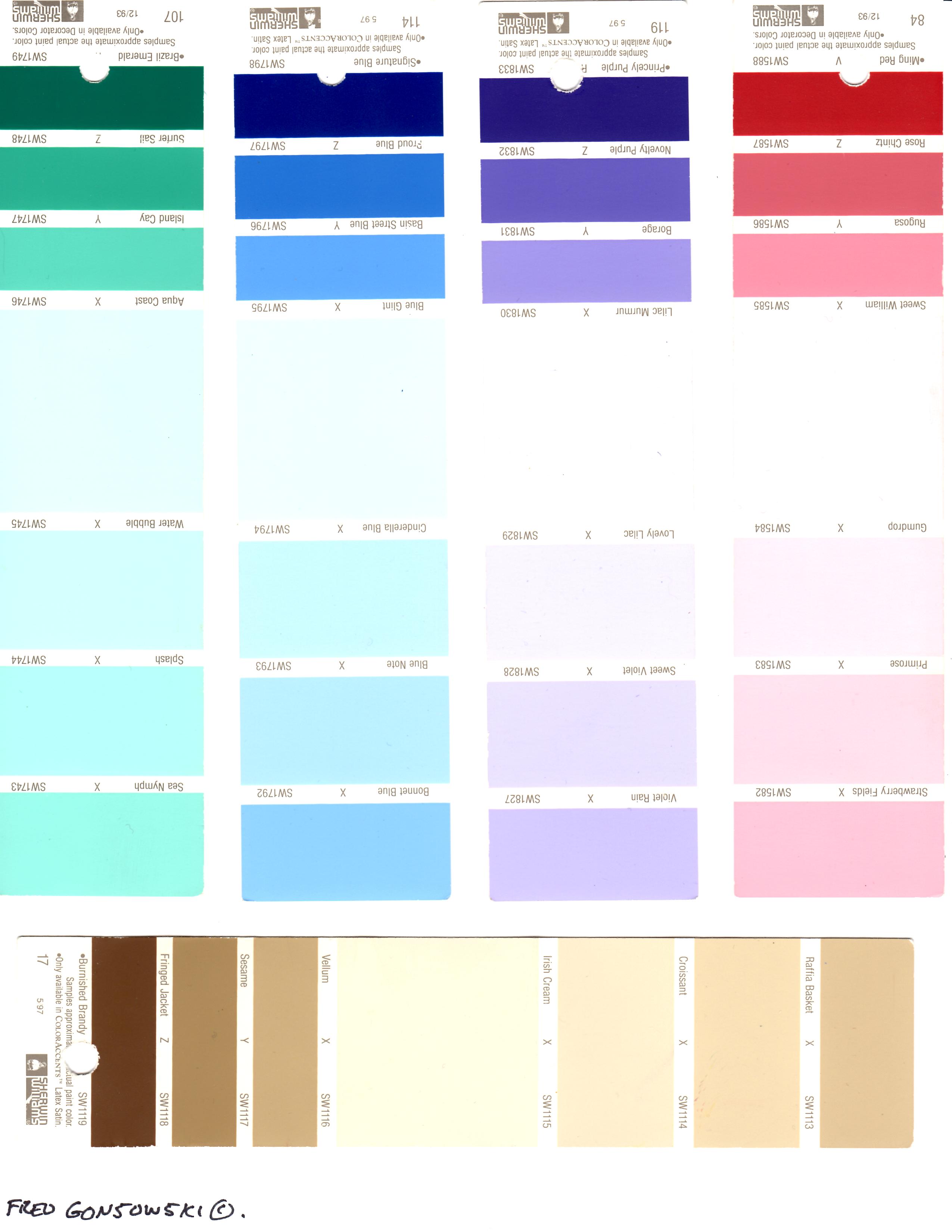
To the right of the wood sample colors on this illustration you will see 4 different samples / shades of Pink which would work best matched with yellow based woods. They are all tints of red-orange, which is a yellow based red. Some common names for tints of red-orange are peach, salmon and coral. The number one and biggest mistake most people make is pairing a yellow-orange or red-orange colored wood with a red-violet tone of pink which comes from the blue side of the color wheel.  On this, and the next paint color sample board, you are looking at all yellow based paint colors, and a couple of paints that go with yellow based woods.
Starting at the top, you have a few different tones of color that would come from yellow on the color wheel. Next you have a number of paint samples that are part of the yellow-green color family. Some blue samples come next. Blue is the opposite / compliment of orange. Orange is a predominant color in many red-orange, orange and yellow-orange based woods. Blue works well with many of the yellow based colors. Also think about the neutral color of the blue sky, which complements all the different color changes as the 4 season go along.  The top two rows of paint color chips on this sample board show colors that would come from yellow-orange, orange or red orange on the color wheel. They all have a lot of yellow in them.
The third and forth row show tans, taupe, browns and even black. If you look at the samples closely you will see they all have a strong golden-yellow undertone, which pulls them to the yellow (warm) side of the color wheel. 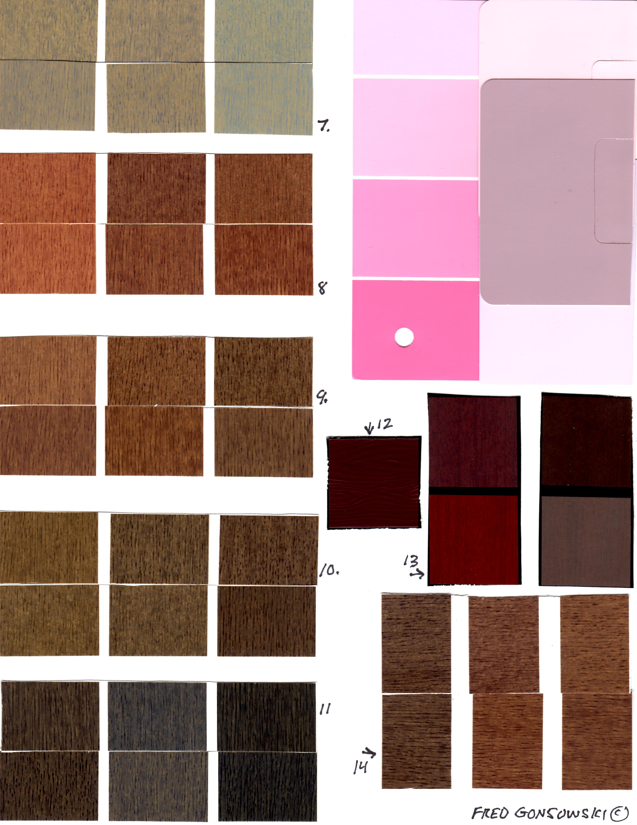 Blue Based Woods and Colors that go with them .. Blue based woods are classified by either their color or grain. Red mahogany, Brazilian rosewood and cherry-mahogany are some examples of blue based woods. They are all reddish-brown and would be red-violet to violet (purple) on the color wheel. Dark walnut and ebony are both dark brown woods. They are blue based colored woods that have blue-black colored grain.
Now look at color sample 7. It shows different woods with either blue grain or a strong medium blue-brown background color.
Sample 8 shows wood that has a violet (purple) undertone and blue-black graining.
Color sample 9 shows wood with a medium to dark brown background with blue-black grain.
Wood color sample 10 shows wood with a medium dark blue-brown background and dark blue-black grain.
Samples 11 show wood that is approaching an ebony color for darkness.
Color samples 12 and 13 show woods that are dark red-violet to violet on the color wheel. Wood color sample 14 shows darker tones of wood sample 9 and 10.
In the upper right corner of this sample board, you have a variety of different tones of pink and dusty mauve which are blue based colors. Pink and mauve are tints (lighter versions) of red-violet on the color wheel. Pinks and mauves derived from red-violet should never be paired with yellow based woods that are orange-red, orange, yellow or yellow-orange colored. 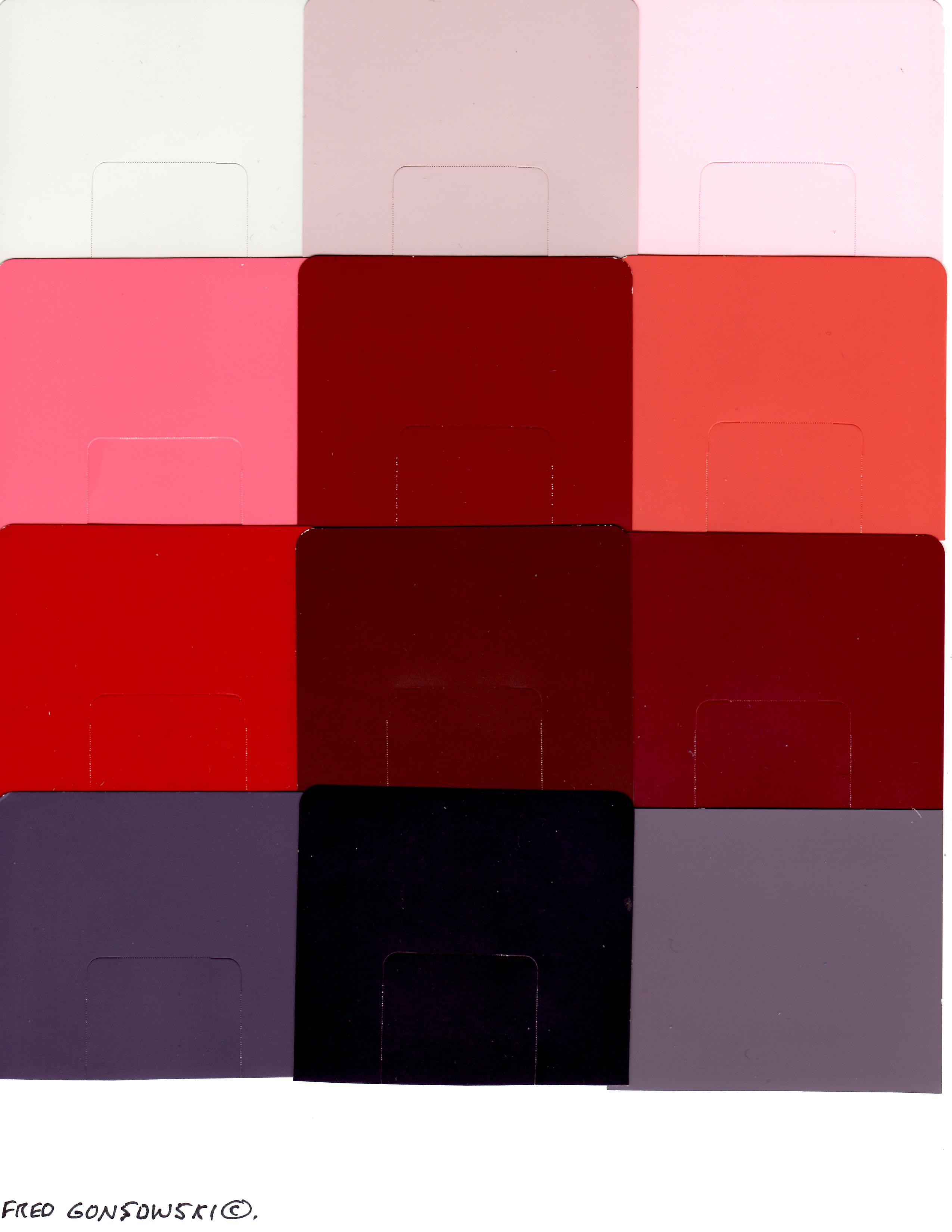 The paint samples on this color board show blue based (cool colors). Black being the absence of color is shown at the bottom center, and its lightest tint, silver-gray is top row left. All the red tones on this board are blue based and are either tints or shades of true red, red-violet or violet (purple) on the color wheel.
 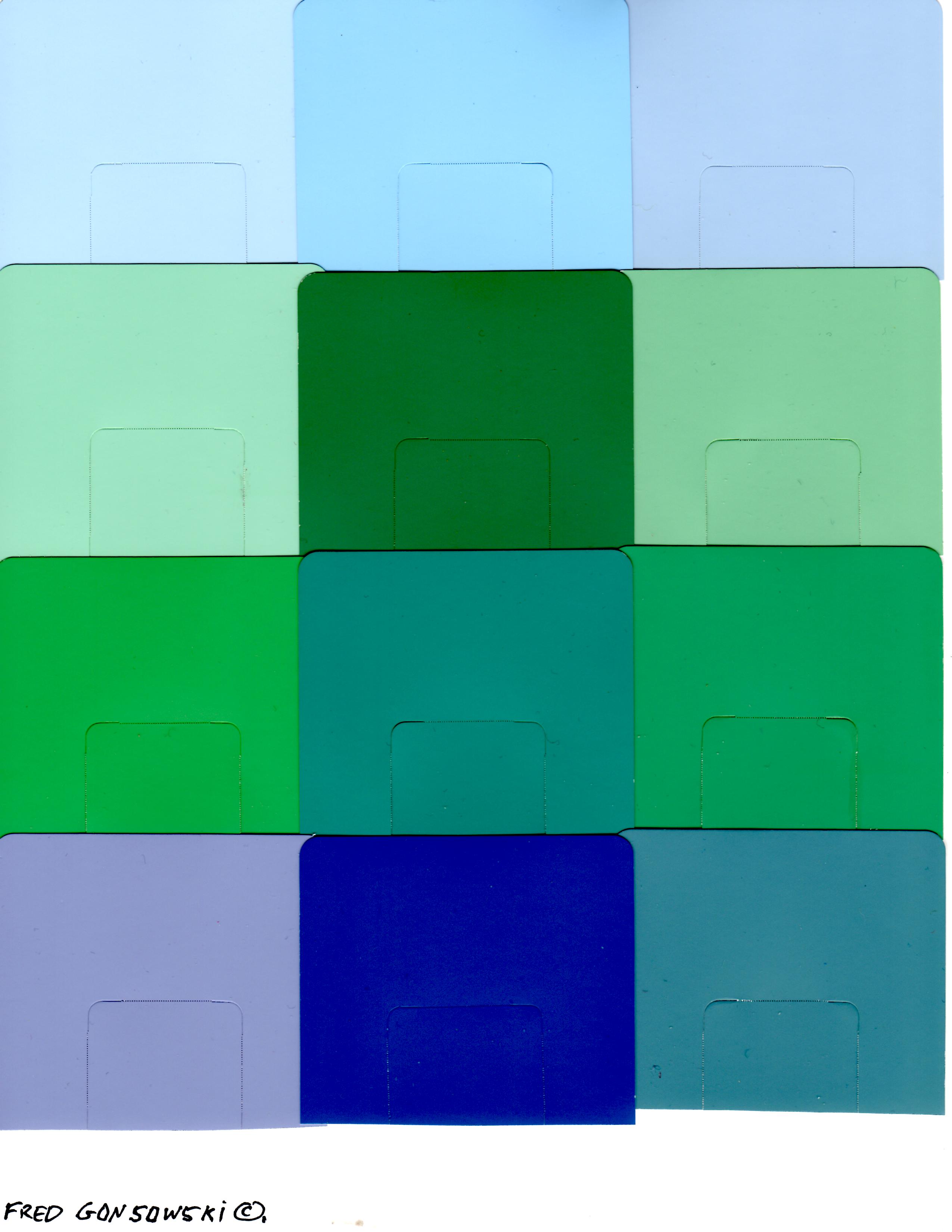 This board shows tints and shades of blue based colors that would be blue-violet, blue, blue-green and true green on the color wheel.
True Red and True Green have a way of sometimes ending up on both the blue (cool) and yellow (warm) sides of the color world. The intensity of the color tones (tints and shades) can suggest both cool or warm color camps. It’s easy to say green is cool and red is hot, but sometimes true Kelly green has a lot of warmth to it. So, the choice is yours where you put green or red.
Finally, the purpose of this post is to get you looking at wood and paint as either yellow or blue based. My assignment for you now is to look through interior decorating magazines, go to paint and wallpaper stores, furniture stores and places that sell carpeting. Look across what they have to offer. Ask yourself Am I looking at things that come from yellow based (warm) side of the color wheel, or the blue based (cool side). Next look at things in nature. Notice how Spring greens are more yellow based than Summer greens. Look at golden-yellow corn and wheat fields in Autumn and notice how red-orange, yellow-orange, and orange tones of leaves complement them.
With the information presented in this post, and a little bit of practice (thought) you will easily be able to know what you are looking at, and it will open your eyes to a whole new world of color exploration.
Companion Posts…
Pick (Use) four colors when Decorating a Room 3-7-2011,
Paint a room a Dark Color, then add Light Accents 3-27-2011,
How to Pick the Perfect GRAY PAINT…A popular Color Choice of the Moment 2-15-2014,
Mixing and Matching Fabric and Wallpaper Patterns 4-13-2012,
Looking at Patterns used in Interior Decorating of Fabric, Drapes, Wallpaper and Carpeting 3-10-2012,
(some other decorating posts)
Arranging furniture TWELVE different ways in the Same Room 9-15-2012,
Arranging Furniture around a Fireplace in the Corner of a Room 9-29-2012,
Arranging Furniture in a 15 foot wide by 25 foot long Bedroom 1-24-2016,
The Right Way to hang Curtains and Drapes 5-3-2011,
The Right height of a Table Lamp for your End Table 5-19-2011


This may be my favorite post! I have read it several times and have read it again today. Color theory is one of my most studied subjects, and this “fills the bill”. I tried to print the lesson, but my printer could not keep the colors accurate. Have you ever considered self publishing your work??? 🙂
****Hi There Everyone***** eHow used this post as a reference for their article titled Designer Tips for Combining Paint Colors with Knotty Pine, written by Jane Burch, here is the direct link to their website so you can read their piece http://www.ehow.com/list_6308262_designer-knotty-pine-paint-colors.html
**********************************************************
Hi there Verna my Biggest Fan, in a way writing this blog is self publishing. I get tens of thousands of readers a month, who I hope I help with their decorating or gardening projects.
I too have had problems printing off some of my posts. The writing part will be fine, but the printer wants to skip some of the images. An IT person who i know said it is sometimes a browser issue. Maybe the images can be moved to “my Pictures” then printed from there, or added to a e-mail, but just printed versus being sent. I have not tried any of the just mentioned myself, yet, but when I have a moment I will try.
I have been busy with the garden, 28 bags of debris have been cleaned up, and are ready to go to the garbage. And, the funny thing is I clean things up really good in the Fall. Things blow from other properties and branches fall from trees.
Hi Fred,
Your website is super helpful and crammed with such practical knowledge..I am slowly getting through all the fab articles! 🙂
I am currently decorating my son-in-law’s home ready for my daughter to move in. It’s a 19th century farm workers cottage with low ceilings, low light and dark redish wood skirtings and woodwork. Half is now shades of grey / taupe but the daughter wants a shake up in what will be their bedroom. I’m thinking of maybe heathers, mustards or dark grey blue feature wall with lighter complimentary walls to lighten the space over all. Am torn though which is the better option. I would highly value your opinion as to which way to take it. Kindest regards…. Debbie
Hi there Debbie, my suggestion is to find a wonderful patterned bedspread or oriental-ish/patterned looking rug that has the redish color from the woodwork in it, then start pulling your colors from one of those kinds of inspiration pieces. Look at my posts How to Pick Paint colors that go with an Oriental Rug which is no different than working with a patterned bedspread, The color Blue, the Next Decorating Trend which will get you thinking about using color, even if blue is not going to be used, and last but not least Pick (Use) FOUR colors when Decorating a Room. Debbie, I don’t know if you looked there yet, but on the Right side of my web page is the word Categories, under that are title of different topics I’ve so far written about. Click on the different titles and all of the posts relating to that topic will be there in one place for you to look at. Good luck with your decorating project, and thanks for comment ;-}
Thank you Fred, I’ll ask them if they have anything suitable we can draw inspiration from. 😊 X
Boy, I’m glad I found this blog; you’ve got some good stuff here. Thank you so much for your time and dedication to the blog.
Sandy thanks for your quick note, it is appreciated ;-}
Hello Fred,
This is a post that speaks to me! I’m afraid we made a costly mistake building our new home. We have white baseboard, doors and trim downstairs, and yellow-based, medium-light wood trim upstairs, with stairs using white risers and wood color steps and rails connecting the floors. We thought we would enjoy the warmth of wood trim upstairs, but the more we live with it, the more we wish the entire house had white wood interior trim. Although we used the same off-white wall paper (it is a solid) both upstairs and down, the upstairs rooms look somewhat sallow and sad against the wood trim! How I wish I had had your post before we finalized our house plans!
We are now contemplating whether to paint the trim white or install new wood trim down the road, with the latter being terribly expensive. I’ve done quite a bit of painting and wall papering myself in the past, but this is a new house and I am not sure if I can bear to live with repainted trim. My husband is quite the perfectionist and may insist we have a professional do it–which I would find more of an inconvenience that if I did it myself!
The other choices I see would be to install new trim (including interior doors!), or just try to live with the wood trim and see if we adjust to it. The funny thing is, my husband has always loved real wood and, although he loves our wood floors, he has remarked several times how he wished he had used white trim through out the house. We still love the stair case as it is now — it is just the trim (and doors) that irks us both! I really don’t think installing another wall paper would fix how we feel about this. The wood trim just looks dowdy to us after being surrounded by white on the first floor. I’ve seen some decorating books with the interior doors one color and trim another, however, I’m not sure if that would just remind me more of my mistake!
Do you seen any other possible way to uplift our rooms/halls upstairs or even a compromise? I welcome any and all ideas! Thanks again for the great blog on so many topics that are dear to my heart!
Suzanne
Hi thee Suzanne What I am suggesting you and your husband do is, in one of the upstairs bedrooms, paint the baseboards and all the trim around the doors, closets and the windows frame and the trim around the windows the color of white that matches the white that is downstairs. Keep the natural color of the door for now and closet doors if they are natural colored, they can always be painted white some time down the line, when you are not soo frustrated, and you might eventually like the doors natural, only time will tell. Being on the inside of the room the white woodwork will be compartmentalized. If you like the look of the first bedroom do it in the next space. Trying/Having the woodwork a white in one bedroom, and even if you choose to keep it the natural color in another room, will be no different than having a blue painted room for a boy and a pink painted room for a girl. Even if you paint all the woodwork in the insides of all the upstairs rooms white, you could still keep the hall woodwork wood tone, as it will be moving the natural wood of the staircase upstairs.
I would say, sand the baseboards and all the other woodwork a bit first to roughen them up, then apply a water-based primer like Kilz, they apply two coats of the finish paint. Run blue painters’ tape around all the woodwork on the floor and up on the wall, it will protect the surfaces around the woodwork and floor and make painting easier.
When I first moved into my house 24 years ago, it had natural colored doors, a mohagony wall in the living room and a TV room/den all in oak. Getting rid of the natural wood was the first thing I did. My mother has a house with all natural colored wood work in every room; it was a popular thing in the 1970’s. I’ve repainted the rooms at her house a few times and I’ve painted all the woodwork around the windows and the window sashes, so far white. Down the line, when she is ready to get new carpeting, I will prime and paint the remainder of the natural colored wood. The natural colored wood has a way of making a colored line that runs around the room and defines the space. It, in my mind chops up the wall space and being predominate, makes the rooms look smaller. White woodwork seems to recede and is less visually.
Suzanne I hope my comments/suggestions are a bit helpful, Good Luck with your project.
Fred, you have some of the best creative ideas– I love hearing your story of how you changed your house –so much so that I searched your site and found “A look at my Painted Doors” post and was fascinated with your murals. I would love to see you get someone to market them –as mural type wallpapers for those of us who also love beautiful vistas. Seeing what you have done to transform your doors and how you describe your transitioning your own home with its minimalist bone structure– so inspiring! Now I know that I can apply a bit of paint to our baseboards and ceiling trim, one room at a time! As the actual windows are already white, it would be just the sills and trim around them that would need paint–so no work on the panes, themselves. I am so inspired. https://fredgonsowskigardenhome.com/2014/01/23/a-look-at-the-hand-painted-doors-here-in-my-house/ I linked your post from last January so that others might see this impressive array of mural work. Many years ago when I was small, I had a distant aunt, who painted nature murals on her dining room wall! Every so often, she would cover it over and do a new one. Yours even top those and make such a good use of an obvious blank canvas! Your guests must just love to visit you. Thanks again for your inspiration and wonderful blog!
Suzanne
Suzanne, all I can say is you are SOO sweet for writing your comment. Thanks a lot!
I am so happy to have stumbled upon this post! I have recently moved into my home and I’m having fun decorating my new space. This post is so helpful to me as I’m trying to blend different woods and paints. Looking forward to more of your posts!
Hi there Michele, happy painting, what fun, and thanks for your comment ;-}
About to renovate our kitchen. New cupboards are hickory stained sienna. I am having trouble deciding between 2 colors for flooring. What are your principles with this? Kitchen is 14 by 15 feet with a sliding door and a 32 inch sink window. A large pass through opening to the livingroom about 6 by 3 high. Off the kitchen is a door way into th e living room beside the pass through, a hall way to the 3 bedrooms and also a door way to the top of the basement stairs. Living room is small in todays standards 12 by 16 feet and is well lite by large windows west and south and a front door.(not much wall space)
OH my appliances are white!
Resale value in our area is very low, so the reno is strickly for our benefit with moderate income.
Hi there Bev, not seeing your house in any way, and not knowing what hickory stained sienna even looks like, I can not give you any suggestions. I do feel, that you should pick some kind of good quality vinyl flooring that is light of color, and possibly has a bit of the color of the cabinets in it to tie the space together. Also try not to have the biggest pattern. A trick here…Go to a few flooring places and see if they all have the same flooring samples you are considering. Take home the flooring samples from all of the stores, and you will be able to place them next to each other and make a larger sample of what you are interested in. I did that when we got flooring for my mother’s house. No one says you have to commit to any store, just because you bring samples home. Just remember which place you got what, so when you return the samples they go back to the right place. (Tape paper sticky notes on the backs of the samples and write on them where you got them from). Bev, Good Luck with your project, sorry to not be of much help.
Thank you for your reply. I have followed your advice and have picked a light beige-ish color. Sienna is orange- red in color and often referred to as Med. in color. Again, your reply was extremely helpful. Presently have stopped shopping for the kitchen until after Christmas. Thanks again. Bev
Thank you for this helpful post. Do you have any advice on which woods go well with pinky beige walls (eg. UK dulux shade natural hessian)? It does not look so pink in the link below but it really does on the walls.
https://www.dulux.co.uk/en/colour-details/natural-hessian
This paint is everywhere in the UK! Including in our rental. So I am wondering if we need to avoid yellow toned wood and have been wondering…does that mean choosing a darker wood or would some kinds of paler wood work? Also, what happens with ‘dark pine’ as retailers call it….does it still retain the yellowness or would it be borderline suitable?
Thanks in advance for any advice and again for the informative post.
Hi there Catherine, I think mahogany and cherry colored woods would work best; but I saw take a large sample of the paint with you when furniture shopping and put it up against the different colors of woods you see, and see what looks best and smiles at you. I would also say do the same with picking fabrics, carpeting, etc, so you will be able to see what works best with the paint color. Good luck with your decorating project ;-}
Thank you so much, it is a bit of a challenge but I will do my best and take a sample as you suggest.
Hi there Catherine, if it is a popular color in your neck of the world, go to a paint store, get many samples (color chips) showing the color, tape the color chips together, to make a larger sample of the color, and take it with you when you go furniture, fabric, decorative accessory and carpeting shopping; that way you will easily be able to pick things that go with your paint color. Good luck with your project.
Hi Fred, Wow! This post of yours is a goldmine! I wish I had found it sooner. I bought my first captain’s bed — which, being a pragmatist in a small space — I LOVE. It has one major problem: It is made of PINE, and I HATE yellow in all forms. It’s a “dark stained” pine so not as light yellow as one sees so often or pinky like the honey-stained pine, but they yellow-orange tones still come though. Blue and gray are my favorite colors, so obviously I’m more of a “cool” person. Next year I will be selling this bed and replacing it. In the meantime, I have to live with it.
I have seen some folks use navy blue and white with pine successfully. What are your thoughts on this? Navy is darker than the blues on your sample boards here. Also, do you have a legend identifying the kinds of woods/finishes you used for your samples? I really like the woods in Sample 9, dead center (both upper and lower rows). What kinds of wood are those?
Thanks again for your incredibly informative work!
Hi there jkd2208, the samples were from Home Depot. Have you ever looked at my post The Color BLUE, the Next Decorating Trend, maybe there’s something in that post that might inspire you.
Thank you so much. I totally love this post and it has sorted out why I’m having such a hard time redecorating. That and my minuscule budget.
I’ve come to the conclusion that the person that renovated my condo in the mid 90s was insane. I’m fighting the combination of light cherry trim (a much loved feature including the beautiful Millette French Doors) with yellow/orange toned maple laminate. I know that painting all the trim mid to dark grey is the solution, but it would eliminate the only thing I like about the condo.
I gleaned from your article that the only colors that would get me out of this dilemma may be true red and true green which funnily enough I had almost concluded myself via a lot of heartache. My picks for highlight decor like cushions and towels are a lovely rich mid red and lime green
My Mum chose cool white for her room and furniture. I’ve gone to pale grey on the remainder of the walls and I’m planning mid tone grey cottage paint for the kitchen cabinets which I’m doingmyself. I will probably use stick on backsplash in silver, white and clear for the tiny tiled area.
Sadly I’m still stuck on the ugly flooring which I can’t afford to change. Can you coat, stain or paint laminate? Probably not on such a high traffic and flexible surface. Grrr!
Hi there BlueSkyRedEarth, Years ago I helped a couple who had a front entry hall done in 1950’s ceramic tiles, and the husband just hated the floor. Well he thought he hated the floor. I went shopping with the wife for an oriental area rug at the time, and once the “area rug” was laid on the ceramic floor, the eye looked at the carpet, and not so much at the ceramic floor it was placed on. It has been over 15 years now, and the 1950’s ceramic floor is still in place.
Your problem is that you are looking at all of those yards of laminate floor. My suggestion to you is to go out and buy large area rugs so they cover up most of the floor space, so you only have a couple feet of the floor showing around the edges of the rooms. Any area rug that is patterned will draw your eye to it. If you can, find area rugs that have just a small amount of the color of your floors in them, so rugs and floors work together. Go to a paint store and bring home every paint color strip that you think matches the color of your floors. Place the different strips on the floor and see which one matches closest. Mark that color match, and when shopping for area rugs bring the strip and see which one goes with what you like. Also bring samples of sofa materials, chair cushions, paint or wallpaper colors for walls, etc, so you have many pieces of your decorating puzzle to work with. If you are just into solid colored area rugs, the solid color of the rugs will also cut the color of the flooring that is not at this time to your liking. Also, if a person has hideous wall-to-wall carpeting and can’t afford to eliminate it at this time, throwing an area rug over the wall-to-wall carpeting will help hide what is hated. Hope I helped you in some way, good luck with your project ;-}
Kathy says:
March 3, 2017 at 2:20 PM
Mr. Gonsowski
Help! Do you travel to CT? I, need to hire you to help with my 5 room 1952 ranch home. I, had two on line designers and these colors are wrong and I wasted a lot of money. I, have hand made antique replica half mahogany, half tiger maple case pieces throughout the house. Oak floors in most rooms, orange yellow stained. Red oak floor in kitchen with yellow orange cabinets. Each room is a different color as was told to me, for the furniture. But, based on your info blog it feels all wrong, and is. A picture is worth 1000 words. But, in person visual may be a must since two other pros got it wrong? Your, blog makes much more sense. But, I’m now overwhelmed. Can you help?
Kathy in CT
Hi there Kathy, where in Connecticut are you? I’ve helped people in the Capital District-Albany, NY area in the past, but have not ventured out that far. The premise of this blog is to get people thinking, and hopefully they will be able to do something creative themselves. As for the so called professionals, not everyone sees things the same. You know, interior decorating is nothing more than an opinion, and how much someone is willing to believe in the advise of the decorator. I could come up with the most creative solution for a project, but it could be dismissed, but if a famous person like Ralph Lauren, Bunny Williams, or Mario Buatta, etc came up with the same opinion, it would be instantaneously considered genius.
March 5, 2017 at 2:17 PM
We are 45 minutes South of Hartford and 20 minutes North of New Haven. If, you can not come even if you told us your fee, to come. Your, blog makes the most sense. Yet, if I do one thing, then, another must be changed. The whole house will need to be re done. How, do I send you pictures? I, will have to organize my thoughts with each issue to you. Where do I begin. I am thinking colors and tones of things that can not be changed, I shall first discuss? Shall we begin with the living room? All rooms can be seen from there?
Kathy
Reply
Oh, I do understand what you say above. Yet, to me even if Ralph Lauren gave me the top advice and you gave me the top advice and yours felt to me correct. You, would be the genius. The “famous” part matters, not to me. The way it makes me feel to live here does. Your, blog makes the MOST sense. Yet, I get so confused room to room. Since I have tiger maple and mahogany both those need differing colors. Yet, all are visible from one room.
Kathy
Thank you so much for this informative post.
What paint color should one choose if there are both yellow based and blue based woods in one room? For instance the kitchen in my rental has mahogany red cabinets and pine or birch colored (not sure which) hardwood floors.
Hi MCT, I had exactly the same problem with the addition of cherry baseboard and trim. After much thought I chose an almost mid tone pale grey leaning ever so slightly towards blue. Benjamin Moore Tundra. It’s not at all yellow or beige, but works well with my slightly beige throws and ivory sofa.
Hi there BlueSkyRedEarth, my blog is all about getting people thinking, and if the color is “smiling” at you, and you don’t question it, you have made the right choice. Thanks for your comment ;-}
Thank you; great idea.
Hi there Marie, I would say go for the yellow based colors, as golden undertones happen to be in most fabrics. Look at the colors of your counter top, and see if you can pull some vivid or even neutral color from it. Have you read my post titled Picking Paint Colors for a Small House, Condominium or Apartment or href=”https://fredgonsowskigardenhome.com/2014/11/24/interior-decorating-ideas-for-a-small-house-condominium-or-apartment/”>Interior Decorating ideas for a Small House, Condominium or Apartment, also look at How to Pick the Perfect Gray Paint…A popular color choice of the moment (substitute your counter color for the word gray and see what you can come up with). Good luck with your project ;-}
Thank you; I will take a look at these articles.
Hi, I love this post. I have one question, what about red cherry wood, Or even mahogany? What color walls should I choose? I want a grey shade, but which undertone?
Thank you.
I’ve read your article in how to pick the perfect gray. I’m still unsure though. 😉
Hi there Vee, my posts are just a starting point, something that might be inspiring or get you thinking, that is all I can provide. Pick out a few gray colors that you might be able to live with, and get many paint samples chips of the colors and tape them together to make a bigger sample of your colors. Maybe when the color is seen in a larger amount you can then choose one that looks best to you. Good luck with your gray paint choices.
Hi there Vee, look at blue-grays, as they will look nice with the red tones. You could also pick a gray-green, as green is the opposite of red, so the color would probably work. Look at the fabrics you have in the room, and try to pick wall colors that will go with them. Read my post titled How to pick Paint colors that go with an Oriental Rug/Carpet. An oriental rug is no different than upholstery fabrics. Also look at my post titled Pick (Use) four colors when Decorating a Room. There might be something in those posts that will help you. Good luck with your paint color picking project.
Hi Fred,
Thanks so much for your insights regarding use of color theory. Being intentional about hues (undertones) is so much more important than I realized. You’ve helped me immensely regarding how to work with red hued wood, as I have cherry wood floors. I never thought about blues and greens being important to consider with this wood color. Fortunately, without thinking about it, I chose pale/mid green oriental pattern rugs (which happen to use a tiny bit of red in the design) for my floors and I’ve been happy with that choice. Wish I had been conscious of these factors all along. Your fortunate readers can truly benefit and avoid costly mistakes. Thanks for reminding me that important factors, such as color harmony, under pin how we feel in a room. I think most of us amateurs just wing it and go by “feel” when experts build from facts they know about light, saturation, undertones, hues, etc. I always thought a good interior designer simply had “good taste” but I see now there is so much more going into their work! Thanks again for all the eye opening posts.
Hi there Suzanne, also look at my posts Pick (Use) four colors when Decorating a Room and How to Pick Paint Colors that go with an Oriental Rug/Carpet. Both of those posts also cover working with color.
Dearest Fred , I believe you might be a life savior ! I am ALMOST finished building my dream home in the low country of SC. My designer got sick shortly after the frame was up and I decided to wing it after that. WHEW , all I can say is y’all deserve every penny you get. This stuff is hard work! I have muddled through and made decent choices( sometimes after crying on my sofa for hours) thanks mostly to the internet and people like you who have graciously helped people like me who are design challenged. Anyway, after reading your fabulous post , I have learned a lot. I know what looks right when I see it but there are SO many paint colors and shades of every color ….I get confused. For example: my new bedroom walls are Ben Moore Horizon. All trim is BM Simply White. The floors throughout the house are hand scraped walnut(unstained). The other bedrooms are BM Moonshine. I am trying to piece things together and use what I can of what I have but so far, most of my stuff came from homes that had oak floors and painted walls of light khaki color etc and I don’t see any connection with my new house. I promise I have read your post 3 or 4 times already and will continue until that light bulb clicks on but …ANY suggestion?? HELP ME PLEASE
Ok , so you are telling me that if I have walnut floors and Ben Moore Horizon OC-53 then I should have what color wood for my bedroom ?
Hi there jhyeargin, after google searching the Benjamin Moore Horizon oc-53 color, I see it is a light gray with golden undertones. If you look at the possible samples of paint that go with the color, they also suggest a blue, gray or brown with golden undertones. You could easily go with mahogany or cherry bedroom furniture. Better yet, go to your local Home Depot, get a free sample that matches your floor color, and bring it with you when you go wood furniture shopping and a sample of the paint.
If you are having an area rugs on the wood floor, and you have painted wood work, then don’t overthink about the choice of wood furniture for your room, as right now you have neutrals.
I once help someone with a ceramic front hall that the husband just hated. When an area rug was put on top of the ceramic floor, it disappeared, because a more predominate rug caught the eye, not the ceramic floor, which really was in a neutral color. The ceramic floor has not been eliminated yet, that was about 15 years ago. Good luck with your project.
Hi there jhyeargin, have you read my posts Pick (Use) four colors when Decorating a Room, Interior Decorating is ALL about Equal Balance, and How to Pick Paint Colors that go with an oriental Rug/Carpet (patterned fabrics and wallpapers are no different than patterned rugs).
Look at the word Categories that is on the right side of the screen, You will see the titles of different topics that I’ve written about. Click on the different words, and you will see posts that I’ve written on the subject. Maybe there might be something there that inspires you.
Thank you so much! I have struggled with this design thing in my new home for a year now. Most choices have been good ones and the ones that I screwed up on were easily fixed but now that bigger , more expensive things, like furniture, have to be chosen I struggle again with my knowledge. I really like your site though and I feel a little more confident every time I read one of your posts. Thanks for your help !
Hi there jhyeargin, have you looked at my posts Mixing and Matching Fabric and Wallpaper Patterns, Looking at Patterns used in Interior Decorating on Fabrics, Drapes, Wallpaper and Carpeting, Interior Decorating..Looking at the Different size of Patterns used on Wallpaper and Fabrics, and Arranging Furniture 12 different ways in the Same room, Arranging Living Room furniture, so Sofas talk to Chairs, like the Pros do, When buying Living Room Furniture, FORGET the Loveseat, buy two Wing, Club or Occasional Chairs instead. Also look at the Categories, seen on the right side of the screen; you will see titles of the different topics I’ve written about. Click on the titles and you will be able to see all of the different posts filed in those “virtual folders”. Maybe you will find something that is of help. Good Luck with your project!
I have cherry kitchen cabinets, cherry wood floor and baseboards. My carpet is builder grade brown/beige the standard that used to be put in new construction. My accessories are black, gold, light brown. orange , very small amount of moss green. I am loolooking for a color of paint. I am considering a nice noticeable warm neutral. On the other side, I was entertaining a warm grey. A lil scary. According to the color wheel, what would be a good color contrast?
Hi there Tammy, I would say look for a “taupe” gray-beige with golden undertones. That way you will have your beige, gold and gray all in one. Go to your paint store, bring home every tone of Taupe they have, but them up next to what you have and see how the color looks. Another option would be to find the brown-beige of your carpeting on a paint color strip, and pick one of the colors from that strip and use it as the paint for the walls. A third option could be a blue-gray. You don’t have blue on your list, but the blue-gray might be interesting. It’s hard to make a real suggestion without not being in the room seeing all the different decorating things you already have. Good luck with your project.
Hi Fred. It seems you have the gift of color decorating! I try to absorb it all by reading carefully and repetitively but feel in over my head. We have a very large teak wall unit (mid-century modern) in an inset wall of a great room. We’d like to paint the inset wall other than the off-white but all my efforts to choose something pleasing seem to be a bust. The walls are off-white (Benj Moore Cloud White). Lots of golden hemlock trim and golden Danish oak flooring in the room. There is a sand-colored sectional/rug plus turquoise/teal and magenta accents. Also, a tall bronze fireplace tower. I had been thinking to match the teak wall unit with the same-colored wallpaper or paint color but my numerous paint sample squares don’t seem to look good. Seems dark and I generally prefer light to mid-tone colors. Now I am thinking something kind of peachy. I would be very happy for any inputs. Thank-you Fred. Marelle
Did you see Fred’s color combo for oriental rug coordination? There is one there that will be perfect for your colors.
Yes, I try to follow it. I find it a very different situation. The red colored walls wouldn’t work for me in that situation. I can’t understand at all how “there is one there that will be perfect for your colors. Huh?”
The link to Kathy’s suggestion is How to Pick Paint Colors that go with an Oriental Rug/Carpet.
Hi there Marelle, reading your discretion of the colors used in your great room, I would suggest doing the insert wall in either the turquoise/teal or magenta. Interior decorating is all about moving color around a room, not isolating it/them, and one of those choices might be quite interesting. If you use one of the two color options, go to your paint store and get every turquoise/teal and magenta color strip they have. Place the strips next to the accent pieces in your room that have the colors on then and look for one of the strips that closely matches the colors of your accent pieces as possible. After finding the closes match, then choose one of the shades of the color on that exact paint color strip, and any of those colors, lighter or darker, on either the turquoise/teal or magenta would work in your room, as they are part of the same color family. The darkest color on any single paint color strip is considered a shade, and the lightest is called a tint. The different tones between the darkest and lightest are achieved by adding different amounts of white to the darkest shade.
If you are afraid of a colored wall, then find a paint color strip with Benjamin Moore Cloud White on it as a tint (lightest color) and pick one of the darker colors on that strip, as the Cloud White will be part of the family of colors on that strip. If you choose to go with the darker version of cloud white, the darker version could look sophisticated, and if you go with a version of the turquoise/teal or magenta the color would be dramatic. The choice is yours. If you have a minute read my blog post titled Pick (Use) four colors when Decorating a Room, that article will help you to understand about working colors around a space. Good luck with picking your paint color for the room. If you can report back, on how the project finally turned out ;-}
Thank you Fred for the helpful reply. I had read the articles referenced and gotten the color strip with my white on it. I was confused with your information since I had gotten the off-white color strip which didn’t show darker colors in the same color family. I didn’t realize there was ANOTHER color strip that would show the family of colors on it for my off-white paint color. Once that was resolved I chose the darkest color on the strip and have painted the inset walls (all fours sides). So I went from Cloud White to Revere Pewter.I had been concerned the new color might be too dark but instead it’s too light! There are 6 skylights overhead and I think they bring in a whole lot of light even on this habitual gray Seattle days and on the inset wall which is recessed in shadow. Now I am wondering how to get darker still and match! I wonder if there is a way to do that on B Moore’s website but there is no help from them to know.
Hi there Marelle, would you ever think about installing some kind of “curtain/shade on your skylights that you could open and close at will and that shade/cloth would be somewhat opaque, but let light pass through it. The fabric shade of sorts would defuse light a bit and cut down on fading. With a shade of that kind, I think it would make your paint color not faded out so much by the abundance of light coming into the room. Just something to think about and look into.
My second thought is to go and talk to the man at your paint store and tell him your problem, and maybe he can make a darker version of your color. All paint colors are made from a recipe, and that recipe should be able to be modified to make it possibly darker by adding larger amounts of certain pigments that make up the final color.
Good luck with your painting project.
Hope you wouldn’t mind helping me with color selections for a home that I am redecorating. I have Mid Century Modern teak furniture throughout my home. The home I bought has a 1960s/70s Red Green and Purple slate entry (deep purple gray, deep red with a slight orange hue and teal gray tiles). The wall that separates the living room and foyer is a light red brick that matches the outside of the home and houses the living room fireplace.
I am replacing the floors, re-painting the walls and replacing the kitchen cabinets and counters and replacing the bathroom vanities. Trim is white. I am also having the sofa re-upholstered.
My sitting room at the far end of the house is the only room with furniture colors that I won’t be changing. It has a deep orange red recliner (same color as the foyer slate) and a chaise that is a bold pattern of geometric shapes in dark greens, blues, reds, purples and a bit of sage green and beige gold.
My favorite colors are wine red, teal and grayish purples.
Looking at Luxury vinyl tiles for the majority of house with carpet in the 2 bedrooms. Would like my furniture and artwork to stand out. I collect wildlife art and have about 35 wildlife art wall hangings that I would like to display. Most are animals in their natural settings. Easy to add to any décor.
I would like a clean and colorful look when my home is complete where my teak furniture works with wall and floor colors. Most decorator pictures make me feel like you are drowning in a sea of neutral and most decorators tell me that the color of the wood furniture can be ignored.
Your post was a breath of fresh air! Thank you.
Hi there Jennifer, Here are a few guess suggestions, not seeing your house or possessions…and these are ONLY GUESSES
My First suggestion….I want you to look at the 35 wildlife pictures that you have and see if there is a certain color of green, if green is the predominant color of the background of most of the prints and go to your paint store and bring home every paint color strip in green, and one by one pass them by each of the pictures and try to see if there are a few colors of green that go with most of your art works and that you could live with. Next put that green paint color sample by your geometric fabric with green on it and see if the greens are compatible with each other. If you find darker colors of green that nicely match your pictures, and it goes with your fabric, but you feel the tone of green is too dark, pick a lighter version of green from that single paint color strip, and because it is from the same family of green color, as the darker tone, it will work.
Suggestion Two… You say you love grayish purple. So bring home every paint color sample in gray-purple that they have, and put the paint color samples next to all of your fabrics and see if there is a tone of purple that goes with the fabrics, and that you can live with, and that could be the color for the walls. As with the green, if the purple seems too dark, pick a lighter version of that color from the paint color strip, and hopefully that will work for you.
Suggestion three… golden beige is one of your colors seen on your geometric fabric. Bring home every color of golden beige they have and see if there is a lighter or darker tone of that color that attracts you. Golden beige is a neutral color that is often seen as part of the color story of many patterned fabrics.
Suggestion four…. Whatever paint color you pick, then paint the interior brick wall to match that color. The painted brick will go with the other walls, and not be soo “period” looking.
Good luck with your paint color picking project.
Wow! Amazing advice from a true color expert! Thank you so much for being so complete in your analyses of these color dilemmas. You help so many of us with similar dilemmas! Once again, you rock Fred!
Hi there Suzanne, far from a true color expert, just trying to inspire my readers; no more no less ;-}
Thank you!
Hi, thank you for your insights, I am painting a door that is the entrance to my master closet. I have chosen a rose wallpaper to accent one wall which is lite pink and gray. My wall will be the pink in the flower, my closet insert is birch, draws and hanging with extending shelves. I purchase a 8 panel raised door that I want to depict Victorian, Whimsical, my pulls are silver stars and moons. The problem is the stain on my door; Do I want honey or do I want red chestnut both are minwax stains. I love your color wheel and will print it for future reference, your color wheel states that I can do either one but which one? Look forward to your response.
I love “ honey”. I, have honey. The contrast, yet coordination with my pink, gray, rose, and your silver stars and moons will look smashing with honey. My oriental has all those rose, pinks, oranges, and creams with blue. So, honey looks just as lovely with it as does my red mahogany furniture. You, can’t go wrong either way. But, I will defer to Fred.
Hi there Kathy, if the pinks are “yellow bases” orange-pinks the honey would probably work great, but if the pinks are “blue based” fuchsia-bubblegum, pepto bismol pinks, the honey might not work so well. When I wrote this post, I was thinking about all the people with yellow based orange looking wood work, as seen in old Victorian houses and how they try to pair it with a blue based pink and the colors don’t match, and they keep wondering what is wrong, but can’t put their finger on it.
Ahhh, yes, I see. Struggling to coordinate that issue with my house too. Having a few oriental rugs that can not/ will not be changed. They, are visible to all three rooms and hall in the 1952 1100 sq. Foot custom rancher. And, to make matters worse. I, have and love tiger maple orange yellow amber. And, have mahogany, blue based red furniture as well. All these custom made, senior retired boat builder, gems I commissioned over the last few decades. Now, put all of this together, all visible to each other. My husband has painted four times and refuses to again. Is there a way to post pic to show you? I, have agonized over three years, thousands of dollars later and think it is close. But, it is not 100%. To satisfy the rules. I, had to put indigo purple pillows in with coral ones. The mahogany needed that. The rug and furniture needed the coral. The paint is good for most, in living room as it’s oakburl a red yellow brown. The other two rooms are now red and yellow based creams, or yellow and orange beiges. The drapes have hung a decade as I can’t find the correct color. These go with the round gulls of the oriental in blue green brown tone. But, I feel they are not the perfect choice. The kitchen valance pulls the kitchen wall color a bit. But, it too, is not perfect. I’m thinking cream lace valance there. Cream drapes in living room. But, then there is no pop. My latest tiger maple stand I almost cried when it arrived. The amber red orange it needed to be is brown. It’s too far and too much work to refinish for the senior man. So, I live with it. Can I send you pictures of this scenario ?
Kathy
Hi there Kathy, first of all I want you to read my post How to pick Paint colors that go with an Oriental Rug/Carpet, then read Pick (Use) Four colors wen Decorating a Room. Those articles will help you. If your oriental carpets are covering up a good amount of your floors, don’t think about them for color.
Hi Fred
I, will re read them. I, have read every article you ever wrote. Most excellent, they are. It’s almost feeling correct here. But, not yet. So, I will re read both.
Thank you
I went to Home Depot and looked at both. I, now say red chestnut. The “ honey” is NOT the same color as mine is. Mine is amber red. Theirs now is yellow.
Hi there Marie, not seeing what you really have, I say, forget my blog post for now, and ask yourself which color caught your eye first and smiles at you the most; that one will be the one for you to pick.
What a wonderful, wonderful blog! Thank you for all the helpful (and free!) information. I was searching for “which colour goes with which wood” and this was the only sensemaking information that came up. It is a cornucopia of helpful information for anybody interested in interior decoration.
Thank you again, keep up the good work and best regards from Germany.
Nora
Hi there Nora, thanks for you note. To find out what I’ve so far written about look at the work Categories, on the right side of your screen and under that are titles of things. Click on the titles and many articles about that topic are filed under there for you to see. Have fun ;-}
I enjoyed readingg your post