
Move Over Radiant Orchid, BLUE is Easier to Decorate with!
The first magazine I picked up showed a house that had different shades of blue paint (probably from the same paint color strip) on all the walls, in every room, throughout that house. They showed a blue front hall with staircase, a blue living room and dining room, and even a blue walled kitchen. The spaces looked zen-calm, airy, and also soo Spring-like at the same time.
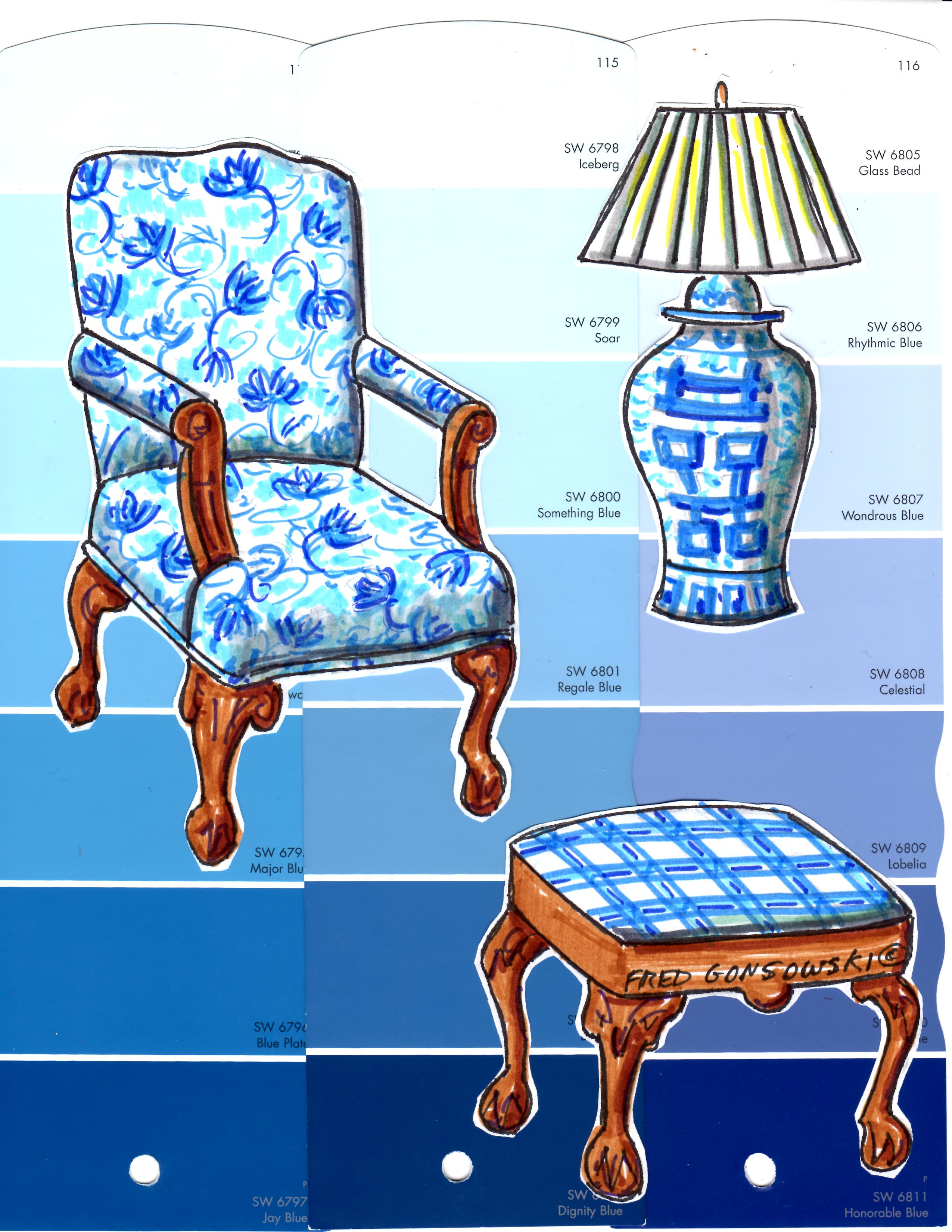
The second magazine I picked up had blue patterned drapes and upholstered club chairs in a living room, along with other blue accessories. The large patterned predominately blue fabric used on the drapes and chairs, made a bold and graphic modern statement in that room.
The third use of blue that caught my eye was when a designer / homeowner covered a pair of sofas in a sapphire / indigo blue velvet fabric. Those bold looking, rich and dark-colored sofas were soo beautifully dramatic, and at the same time looked comfortably cozy.
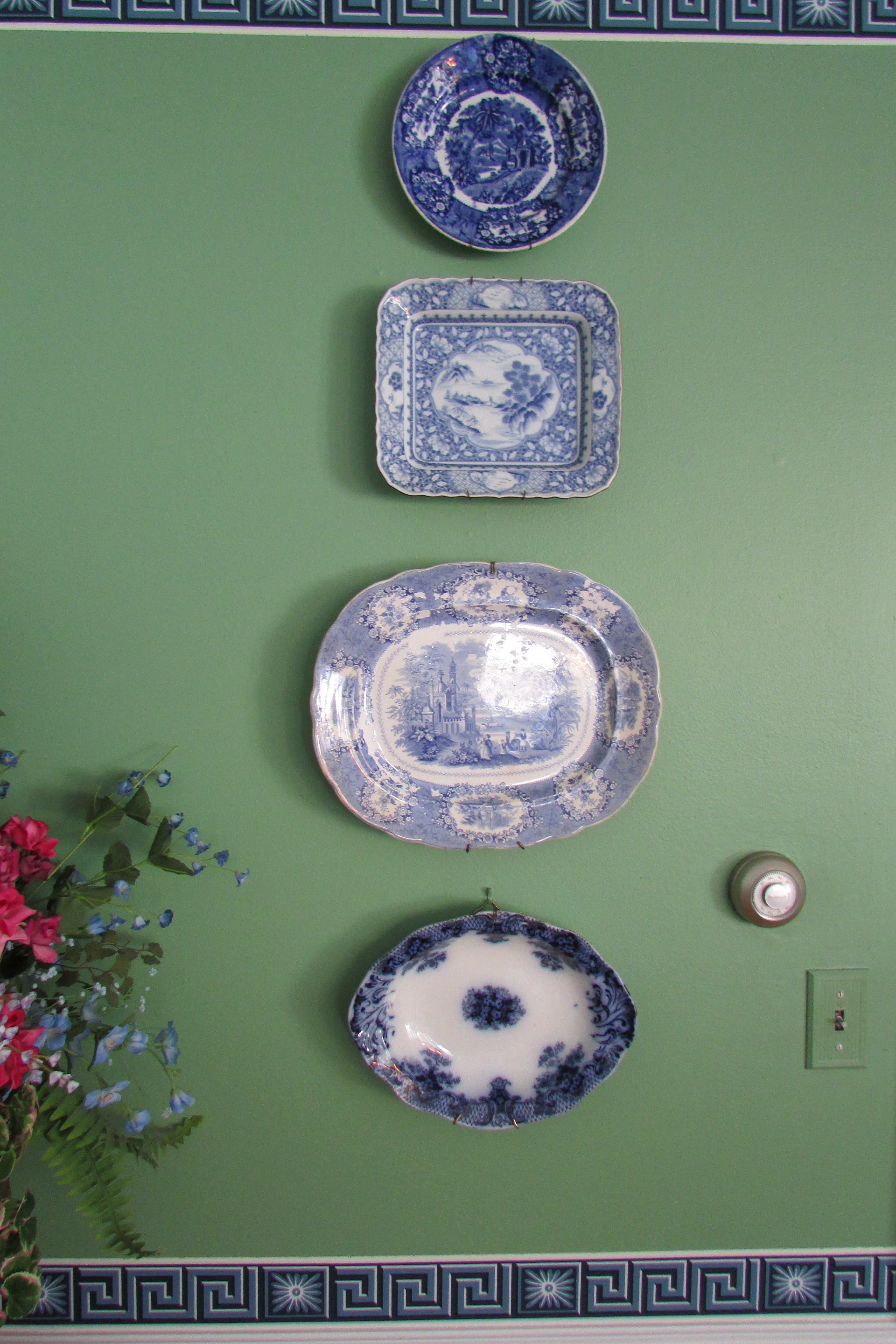
The fourth magazine I paged through featured a large collection of Chinese Blue and White vases, urns, bowls, etc on its cover. Blue and white porcelain has been a classic, used in decorating for hundreds of years. The popularity of blue and white ceramics goes through periods when it’s more or less attractive to the decorating crowd. It’s nice to see it, hopefully, on the upswing again. 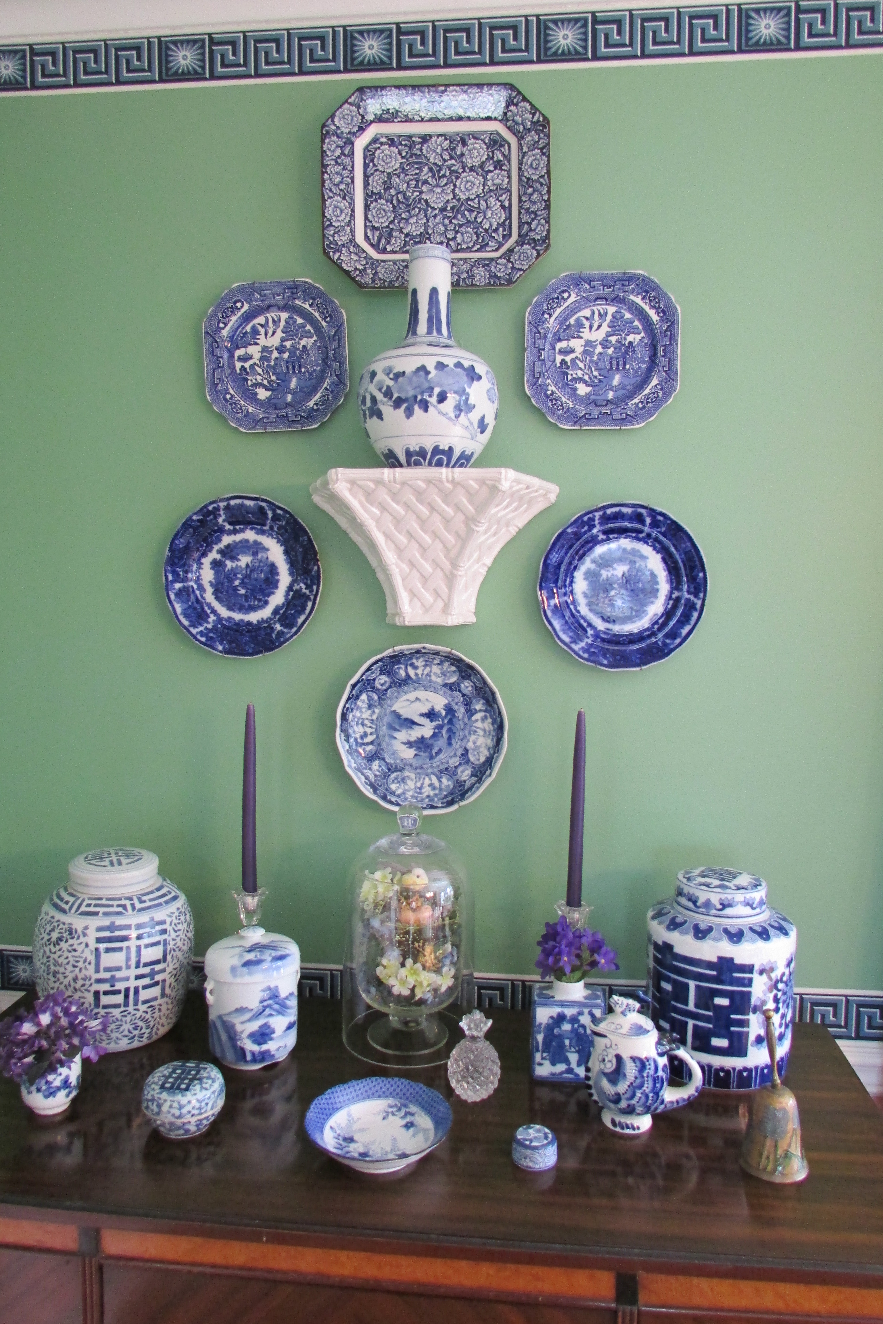
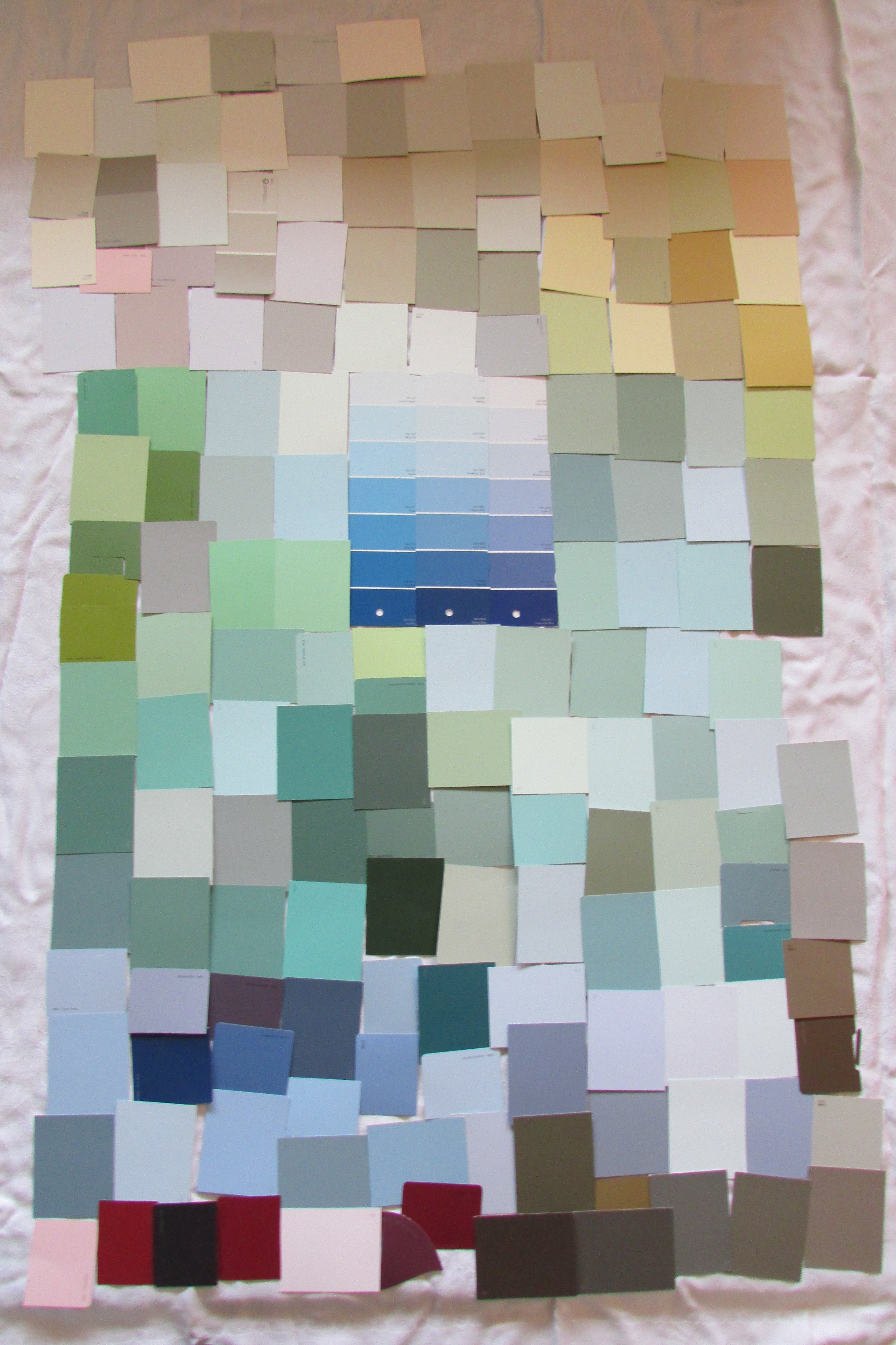
When decorating a room in the color blue, or if you like, your whole house, the best place to start pulling your blue tones from is an inspiration piece. An inspiration piece could be (1) a Chinese blue and white vase, bowl, dish, etc, (2) a patterned fabric or carpet that is predominately blue, or has some blue in it as part that textile’s color story, (3) wood or metal furniture if it is painted blue, or (4) the blue from a wallpaper border, like shown above.
If a person was starting a blue color scheme with an inspiration piece like the solid colored sapphire / indigo velvet fabric used to upholster the two sofas, that I wrote about earlier; they should first find a paint color strip with an exact paint color match to the sapphire / indigo velvet on it. Any of the other lighter colors on that single paint color strip would work perfectly with the sapphire / indigo velvet. Being a dark color, the sapphire / indigo color on the paint color strip would, most likely be the darkest shade on that paint strip. All of the lighter tones on that single paint color strip would be made by adding different amounts of white to the sapphire / indigo to lighten it. The lightest tone of all the colors on that single paint strip is called a tint. It has the most white added to it of all the different tone on that single paint strip.
Now on the flip side, if a person had an inspiration piece that had a light or medium tone of blue on it, and wanted to put it with other tones of blue, they should first find a paint color strip that has an exact match to the light or medium blue on that inspiration piece (fabric, carpeting, etc), and any of the darker or lighter colors on that single paint color strip would work perfectly with the blue tone on the inspiration piece. Again, all the tones are from the same color family.
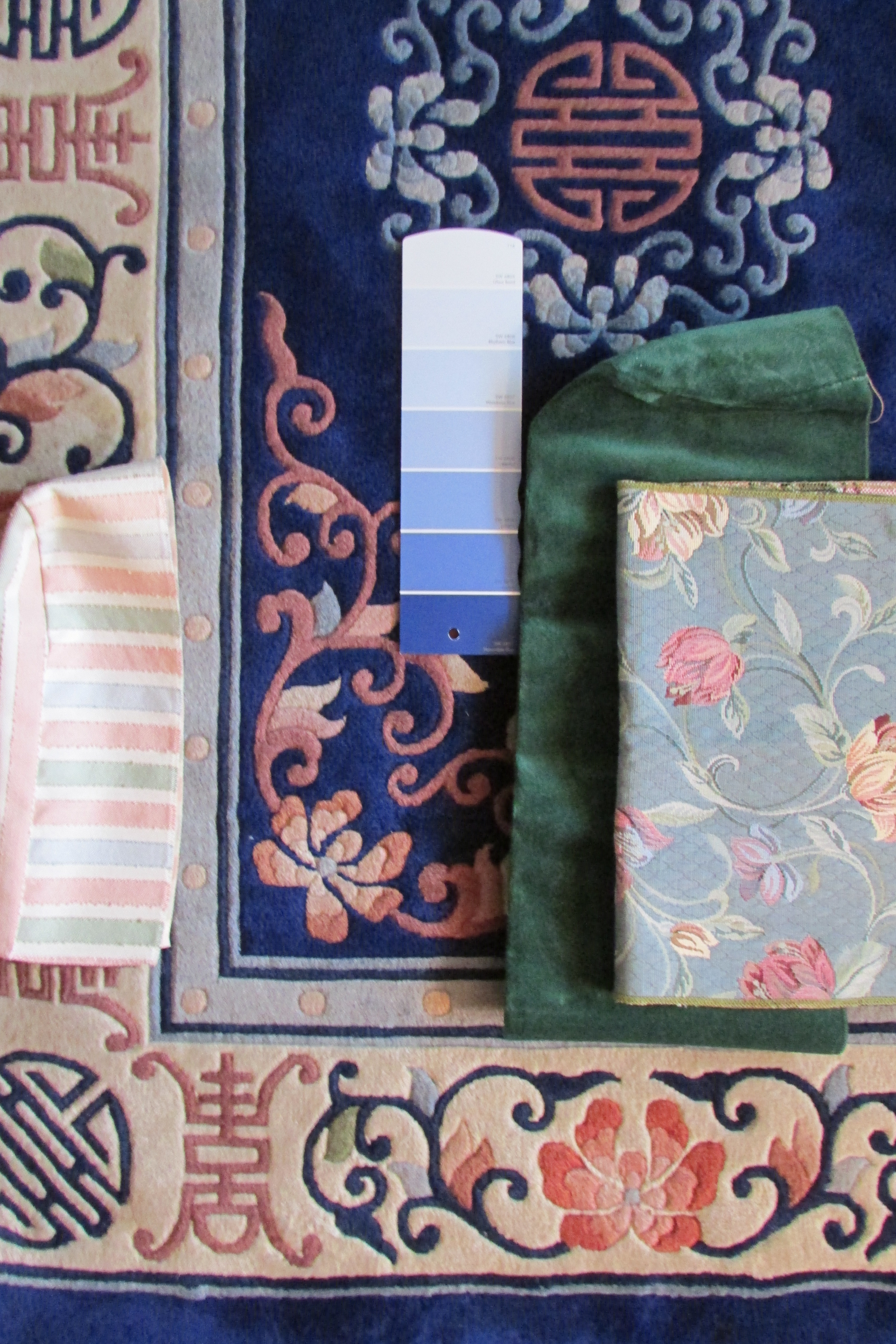
Tones of Blue pulled from the background color of a Patterned Rug
The photo also show how multicolored fabrics, which have blue and green as part of their color story, help to bridge (bring together) the deep blue of the carpet and the deep green fabric used on the sofas. Both the stripe and floral fabrics have green and blue tones on them. With a color story like this, other furniture pieces upholstered in coral tones, golds and creams would work well.
Looking at the different colors shown on the rug and fabric samples in the photo, a person could paint their walls blue, gold, coral pink, blue-green or even different cream to putty tones pulled from the off white edging of the carpet.
Also, looking at the photo, notice how the carpet is the predominate pattern shown, and the floral upholstery fabric is less strong. Also notice how arching flowers work around the edge of the area rug, and similar, but more delicate arching shapes are on the upholstery fabric. There is a similarity of movement between the two, which suggests they belong together.
Colors that go with Blue
The colors that I personally felt worked best, with some/all of the different tones of blue, on the three paint color strips, that were next to each other in a paint color fan, are arranged around them. To me, I liked a lot of the blue-greens, some lime greens, taupes (gray-beige), some golds and soft yellows, different tones of gray, a few browns, as well as true red, blue toned reds, burgundys, rose pinks and purples. I also found that I likes some, but not too many, mossy greens with the blue tones. The majority of the paint colors I liked were part of the blue based colors shown on the lower part of the color wheel; they are below the center horizontal line.  The paint samples I liked least, with the three blue paint color sample strips, are paints that are yellow based. They would be part of the warm colors shown above the center horizontal line on the color wheel. Those color seemed to be a bit too yellow-green, golden-brown, red-orange, celery toned, rusty, or too coral pink or orange looking. Even though orange is the exact opposite of blue, many tones of orange I found too harsh to pair with blue, unless used sparingly as an accent when interior decorating. I think some tangerine and apricot tones look nice, as long as they were not too bright.
Paint color parings are a personal thing. My opinions about color might differ from yours, but my advice to you is, if you have a paint color that you like (are set on), and want to pair it with other paint colors, do as I did, and pass it by every other paint color strip at the paint store. Take one of each paint sample that you like home with you. When you get home, you will, with time, be able to whittle down your choices to just a few, and you will finally pick from them, the right one for you.
A lot of the time you will not have to go through all the work of figuring out what goes with a color like blue, when decorating. If you have an inspiration piece with a color like blue on it, and there are other colors on that fabric, rug, etc, all of those other colors will work perfectly when decorating your room.
I hope this post got you thinking about, what I think will be the next trendy, the color blue. Blue is a classic that has been around forever. A color like Radiant Orchid might be in for a season. but will be quickly dismisses, and once gone never heard of again.
If you are thinking about introducing blue into your home, even as an accent color, try to have / use it in a few places in the room you are decorating. If any color is just placed in one spot, the eye goes right to it, and stays there. If you put it in three or four places in a room, the eye keeps moving from one bit of that color to the next bit of that color. Interior decorating is all about moving color and repeating patterns from one spot in the room to another.
Companion Posts..
Pick(Use) Four colors when Decorating a Room 3-7-2011,
Picking the Perfect GRAY PAINT.. A Popular Color Choice of the Moment 2-15-2014,
Decorating Ideas for Pre Lived in New Homes 4-17-2011,
Paint a Room a Dark Color, then add Light Accents 3-27-2011,
When Decorating a Beige Room, think Tones, Texture and Sculptural Interest 3-16-2011.
Looking at Patterns Used in Interior Decorating on Fabric, Drapes, Wallpaper and Carpeting 3-10-2012,
Looking at the Different Sizes of Patterns used on Wallpaper and Fabrics 3-20-2012,
Mixing and Matching Fabric and Wallpaper Patterns 4-13-2012.
The Right Way to Hang Curtains and Drapes 5-3-2011,
Arranging Furniture, so Sofas Talk To Chairs, Like the Pros do 9-7-2012,
Arranging Furniture Twelve Different ways in the Same Room 9-15-2012.
The Right height of Table Lamp for your End Table 5-19-2011,
Hanging Pictures around a Room 8-3-2011


Fred, you read my mind. I’ve been wanting to paint the walls blue for years but the right blue is tough to select. I’ll bookmark this article. Thanks. Susie.
Hi there Susie,
Putting up this post was just the worse thing for me. I started typing in the article, and added the pictures. I then decided to take out one of the pictures. When I tried deleting it the dashboard locked, I could not see the preview, and I thought What should I do?? I thought just finish the post and publish it, I could fix it after being published. Anyway up it went and things were really off. Some of the text ended up before the picture, and other parts were missing. After a while, I was able to make the changes and correct it, but 13 people, probably from the Plus Follow group saw it. They probably thought I was having a melt down, or was drunk or something. I have not looked yet at the amount of followers I have, but if I’m down 13, I know it was that. Sometimes it is better to not have followers as you have a chance to make corrections if problems happen. Now I completely understand the words “Having Technical Difficulties” ;-}
Bummer. I worked in IT for years so I can appreciate this experience.
Susie, I’m more of an artist, than a computer geek (probably using a different side of the brain) so I’m lucky to be able to write an article and send it up most times. This experience, annoying as it was, made me feel I can get through things, even if things don’t go right instantaneously. Luckily it only happened once, so far, in the three and one half years I’ve posted things. ;-}
Hi Fred,
As always you have your pulse on the current interior trends and are sharing invaluable information with your faithful followers.
Ironically, I am updating my family room, painted in Behr’s Fioli Yew with navy accents. After living with a transitional oriental area rug for two years thinking it’s predominate color was black, I used a tip from one of your earlier posts and took a picture of the rug in good light. Guess what? The predominate color is navy! I’ve had at least two “designers” help me in this room and both thought, as did I, that black was the predominate color.
Since my hubby won’t let me reupholster the sofas or re paint the room (killjoy!) I decided to update the lamps with navy blue ceramic ones and add navy and gold chenille armless club chairs. Also updating the sofas with cool pillows that bring the gold and green tones from the rug up onto the sofas. So excited about this project. I hope it turns out like I see it in my minds’ eye.
You really are the best. Your advice has been spot on. Thanks!
Hi there Shondra,
Years ago I helped a friend pick out things for her living room. The fabric was a tapestry with a black background that had a fruit and flowers pattern on it. We found that sofa and matching chair, here in the Albany, NY area. To go with it, we went to New York City and we found the most incredible oriental rug, it was hand tied and had Pandas on it. She is an animal lover and had to have it, and the rug worked perfectly with the fabric chosen. Other pieces of furniture were found, walls were painted and the look was just right in that house, she lived in at that time.
Fast forward, she has left her old 1920’s house and is now living in a new construction town house. The place now had big windows. That tapestry fabric’s black background, turned out/was really a dark navy blue, or maybe a blue-black. The look of the pieces still worked fine together, but in a different kind of light, the fabric changed. We never say the difference of colors even thought we looked at the fabric at the furniture store, at her home and along side the rug in the NYC show room. SO I know exactly as you feel.
Turn your rug 108 degrees and see if the color is more or less dark. Ever oriental rug has a lighter and darker side. That little change might help you even more with the color. Also, to the color story you are making, think about adding a burgundy red or a paprika (dark red-brownish orange) to the mix, as an accent for a subtle pop of color. Find some paint color strips with those colors on them, and put the strips up next to what you have it see if either of them works. If one does, go out and find some things like a pillow for a chair or sofa, a throw, some vases, a dish on a coffee table, or some small accent piece in that color.
Good Luck with your project ;-}
How did you know indigo blue and Chinese export ware are two of my favorite things! I used to “do” blue and yellow and still have that combo in a Bath with the original 1914 watered blue tile. I find it’s a great neutral and goes beautifully with lavender grays and white, but not so nicely with greeny grays. Funny you should mention paprika in your reply as my MB persian carpet is indigo blue on a beige background (paisley patter overall) with oxblood detailing. I love it.
Hi there Teresa, the paprika color is kind of an orange-brownish red, and orange is the opposite of blue on the color wheel, so some tone of the color red orange would possibly work. Burgundy or possibly oxblood could be next to blue on the color wheel. A lot of colors work with other colors, but it is the tone and shade of the color that makes all the difference.
I absolutely love your posts. And your beautiful drawings. And your amazing property. I have a close friend with a farm that has that same long winding entrance road with all the green grass lovely trees , a beautiful catfish filled pond, a small church, a lovely home and other guest homes, barn, and beautiful land. Looks so much like your photo of the long road. Thank you for including your drawings. They were the inspiration for me to start doing watercolor and, you answered a color question for me about a paint color I love by farrow and ball called brassica (?) and you helped me figure out what the colors in it actually are. Thank you so much for the fabulous information and gorgeous artwork you share. You are crazy talented( that means incredibly fantastic)
Karen
Hi there Karen, hate to ruin your fantasy about what you think my land looks like, but the picture across the top of my website is a WordPress picture, it came with my site when I got it. It reminds me of the row of trees that border my land and my next door neighbor’s place. Look at “A Garden Tour of My Property..” and you will see my land.
I looked at the Farrow and Ball color Brassica. It is a medium tone of Battleship Gray. I looked at it a few times, and I think you can get that color by mixing black, white, a touch of purple and a dash of yellow ocher. Good luck with your water colors, I’m glad that my colored pencil and magic marker pictures inspired you. Did you look at my other art works. Click here, and here to see a few other things I made.